Making the 2013 Calendar, Part 2

Here is Part 1, which details my thinking going into the making of this year’s Wondermark Calendar. I finally decided that I wanted to make another calendar this year, but began to think about how it could be done differently.
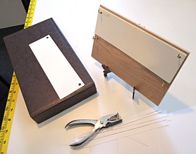
As detailed here, previous years of the Wondermark Calendar were comprised of cards sitting in brass desk easels. And since I knew that lots of people already had those easels, which are reusable, I knew that whatever I made this year should be about the same size as the previous calendars (which consist of a stack of 8.5″ x 5.5″ cards, thusly.)

But I also wanted to make it a progressive calendar, one that kept up with the days and weeks, rather than jerking to a halting stop every month until restarted. There must be a better way. A scroll? No. A waterfall? That doesn’t even make sense. A book? That’s not a calendar at all. Some sort of plant or food? Unexportable. A living animal with a lifespan of exactly one year? If I could figure that out, I wouldn’t be a cartoonist.

This is what I landed on:
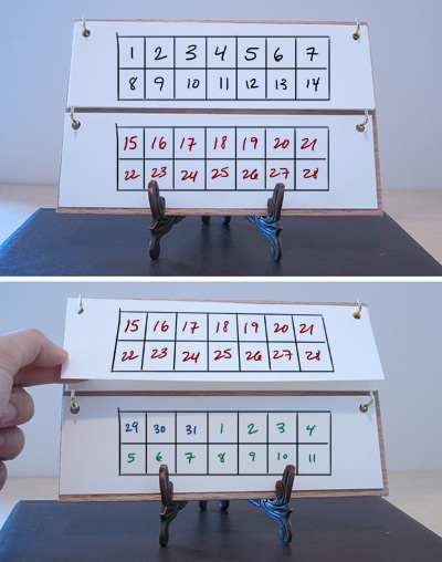
It would be a stack of cards, each half the height of the previous calendar cards (which covered a month each), but each only containing two weeks. There would be no gaps between months. And when you passed the date on the top card, you could simply move the bottom card to the top and reveal a new two-week period on the bottom!

IT WAS THE PERFECT PLAN.

BUT WOULD IT WORK????

It sure seems to!
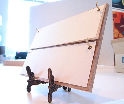
I’m not totally sure how it’ll read over the course of the year — it’s possible that it may take some getting used to, but ALL GREAT THINGS REQUIRE EFFORT so I’m not too worried about that. Overall I’m pretty intrigued by this concept — it seems archaic, in a pleasant way. It is even guaranteed to work if the power goes out (visible light permitting).

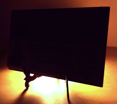
As you can see in this picture, rather than the cards sitting loosely in the easel as before, now they’re suspended from hooks affixed to a rigid backboard, which then itself sits in the easel. I think this makes for a very distinctive approach, but it does require some small amount of preparation. I’ll include a little baggie of hooks with each backboard (unassembled, so it can all ship flat), and I’ll even drill pilot holes in all the boards — so when yours arrives, you can put it all together in moments. I want this thing to work for you instantly.

Presumably, if this design works well and I decide to do another one, you will be able to keep the boards and simply re-order a refill of cards in future years! BUT LET’S TAKE THIS ONE STEP AT A TIME.

NOW, WHAT TO PUT ON IT?

The obvious elements to include on this calendar are: Dates. Holidays (including our new holidays). Illustrations and text.

I like inventing details about Gaxian culture (as in the Ask a Gaxian columns), so after a few misstarts and dead ends, I landed on the title THE GAXIAN ALMANAC.

Doing the math revealed that the calendar would need twenty-seven distinct cards to cover the entirety of 2013, so I decided to adorn each card with a factoid about Gaxian culture, history, or biology.

Now, it would be easy enough to make a bunch of Gaxian collage-images in the usual style. But since, for the first time, this calendar was to be machine-printed rather than hand-printed, I really wanted to do it in full color. And doing the collages would mean working at least partially digitally, when I really wanted this thing to feel hand-made.

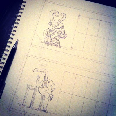
So I started to draw.

TO BE CONTINUED…IN PART 3!!

The full title of the calendar is The Gaxian Almanac for Earth-Year 2013: Containing Elements of Knowledge Familiar to All Gaxians — An Entertainment for Enthusiasts; A Memento for Expatriates; and a Primer for Converts. It is available for pre-order now. As of this writing, out of 200 copies, only 124 remain. (UPDATE: They’re all gone now.) Each copy will be individually signed and numbered!

Announcing the 2013 Wondermark Calendar.

Last December, at the end of a significant period of stress that I never wish to repeat, I said this:

These beauties [the 2012 calendars] are wending their way to 175 of you right now. I hope you like them! They were very difficult to make. I will not be making them again like this next year; five years is a good run.

But not to worry! I have…another idea. A different idea.

It will wait to be revealed, until then. Stay tuned!

That time, my friends, has come.

BUT FIRST

An obligatory reminder about the TopatoCo shipping deadlines! Here is their grid of dates and different types of shipping services. Today, December 7, we start to get into the scary zone. If you’d like to make an order and have it arrive for Christmas, please don’t delay.

P.S. I stumbled across an overlooked box of limited-edition Machine of Death hardcovers! My eyes goggled out of my head when I realized what it was. They’re up now in my TopatoCo store.

My in-house store, selling holiday cards, stickers, books, and yes, calendars, will be shipping products through December 18. I can’t control the Post Office, and I don’t ship as much stuff as TopatoCo so I’m not as comfortable making predictions about arrival dates, and so I can’t make any guarantees — but most orders are going out within 24 hours, and will continue to do so until the 18th. (The calendars should start shipping by the end of next week.)

NOW THEN.

Six years ago, when I first conceived of the idea of making hand-printed calendars (as detailed here), it was because I had access to a Print Gocco screenprinting press. Popular in the eighties, and revived more recently by crafters and DIY fans, it’s a cool, compact printing device from Japan that uses expendable supplies such as bulbs, screens, and ink.

Unfortunately, the Gocco was discontinued by the manufacturer in 2005, and the number of supplies in their warehouses (and on retail shelves worldwide) began to dwindle. Fans of the Gocco’s simplicity and versatility have tried to come up with aftermarket workarounds, with some success; for the last couple of years, I was able to combine OEM and aftermarket supplies in strange ratios to get the calendars done.

But last year was the toughest: some of the third-party inks I found were difficult to work with, and all in all it became a much more complicated endeavor than I had anticipated. I still enjoyed the creativity and the craftsmanship involved, but the logistical hassles were proving increasingly significant.

A New Way Forward

The simplest solution would be to completely abandon the idea of doing calendars. Making calendars in general is a little scary, because you have a deadline to get them done (the end of the year, or more practically speaking, Christmas), and of course they have no shelf life, so you try to only make as many as you have demand for. I’ve been very fortunate that the calendars have proven popular, and I’m very grateful for your support — so I wanted to keep making something fun, for the challenge of it and to have something for those of you who ask after the new calendar year after year. But I didn’t want to run myself through a woodchipper to do it.

The first concession to the process was clear: future calendars had to be professionally printed. That was glaringly obvious. After investigating alternative hand-printing techniques such as letterpress, I realized that (at least for now), I’d rather leave the actual printing to professionals. This year’s calendars are being printed here in Los Angeles by DSJ Printing — the same company that makes my greeting cards, our Machine of Death cards, my MaxFunCon booklets, and any other strange thing I need done. These dudes are pros.

But I still wanted the product to have a lot of hand craftsmanship, to make it special. And I was curious if I could do something different with the format — to change the way a typical calendar operates.

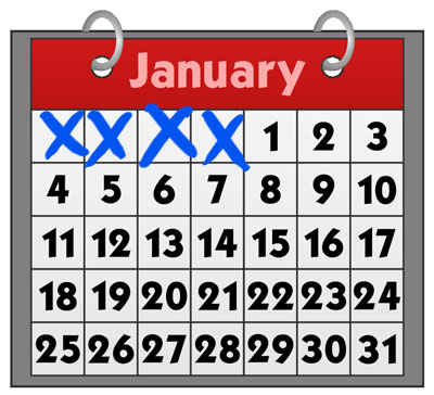
What I don’t like about most monthly calendars is that all this:

…is just wasted space! Those are ACTUAL DAYS that get repeated on each page of the calendar, but are blanked out on the “wrong” page, just for the sake of breaking the pages into individual months. Additionally, when you’re on this day:

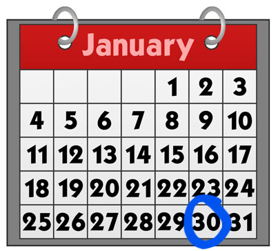
…you can’t look forward to the next week without flipping the page over and losing the current day. Your current day will show up as a blank square at best, or off the top of the page at worst, on the next month’s page.

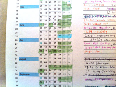
This is all pretty petty complaining, but I’ve always preferred full-week calendars like this one I made for my own office:

…because looking at the weeks and months all smooshed together back-to-back, AKA the way we actually experience time, just makes more practical sense. If today’s the 28th, which do I care more about: the month that’s gone, or the next few weeks ahead? EXACTLY.

To adapt this idea into a desk-friendly format, I came up with the idea for a a 27-page biweekly calendar, two pages of which are displayed at any given time. This way, no matter the current date, you always have at least two weeks ahead of you visible.

But how could it work? What would it look like? And how would it capture the traditional Wondermark-calendar charm?

THE ANSWERS TO THESE QUESTIONS…TOMORROW!


The 2013 Wondermark Calendar is now available for Pre-Order. UPDATE: They’re all gone now! (Ships mid-December.)

Free Dick Van Patten stickers

I work from a small office/studio here in Los Angeles. The previous tenant was a management company of some small repute. Apparently the company did an event with Dick Van Patten (of Eight is Enough and artisanal dog food fame). As far as I can tell, it was a one-off event, and Mr. Van Patten was not a regular client of this management company.

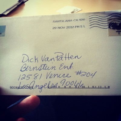
HOWEVER, I occasionally receive letters here at the office made out to Mr. Van Patten, care of the management company. The letter in the picture above, received today, is the fourth or fifth (from different people) since I moved in two years ago. This DESPITE the fact that if I Google “Dick Van Patten mailing address” there are SEVERAL potential addresses that result, exactly ZERO of which are mine. I figure my address got somehow added to a shoddy database somewhere, one that seems to be only accessible to strange old ladies who want to request signatures on ancient trading cards, or notes of encouragement for ailing relatives.

Needless to say, despite any sympathy I may have for their various plights, I am not Dick Van Patten, nor can I speak for him in any way. So I made the following label to return today’s letter safely to its sender:

Hopefully that should clear up any confusion.

As I mentioned the other day, I’ve just released my new holiday cards for the season!

I’ve also just stocked the store with copies of our new, cheap-as-possible Machine of Death Disposable Edition as well as a few copies we have of some of the various MOD foreign editions (German, Spanish, French, and Italian).

And my Hyperbolic Upgrade Stickers make great stocking stuffers!

I’ll get to the point: any order from my in-house store between now and Christmas gets a free RETURN TO SENDER – DICK VAN PATTEN IS NOT AT THIS ADDRESS sticker tossed in as well. That’s right, FREE. Never again will you be powerless to respond when Dick Van Patten’s mail is mistakenly delivered to your address.

oh and let’s keep this real quiet for now

but I put my 2013 calendars up for pre-order UPDATE: They’re all gone!

Friday Night: 826LA Grand Opening

Tonight, Friday the 30th, is the grand opening of the 826LA Mar Vista Time Travel Mart! 826LA, as you may know, is the Los Angeles branch of 826 National, a nonprofit tutoring center for kids (focusing on writing).

Their newest tutoring center is right in my neighborhood, in Mar Vista on the west side of LA. I’m pleased to announce that the Time Travel Mart will be stocking Wondermark books and posters, the proceeds of which will benefit 826LA. I’m doing some volunteer tutoring and design work for them as well — it’s a great organization and I’m pleased to be a part of it.

Join us from 7-10 PM tonight for the grand opening party! Or visit 826la.org to learn about becoming a volunteer (or 826national.org to find a branch near you).