How to Make a Calendar, Part 4

Printing Pluperfect

Continued from Part 1 / Part 2 / Part 3

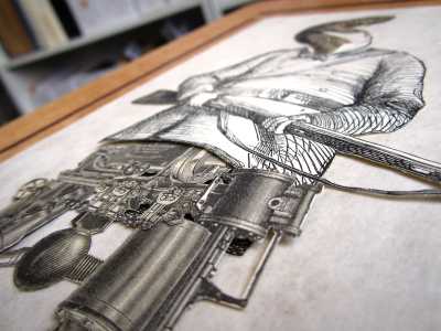
With screens prepared and supplies obtained, it’s time to print! Each screen is inked (above), affixed to the GOCCO, and THE PRINTING BEGIIIIIINS

One new challenge we had this year with the thermofax screens was the concept of cleaning and re-using the plastic frames. At the end of a run, the screens typically end up looking like this:

With the help of magical chemicals, we scrape and clean the ink off each frame, the mesh screen itself gracefully retired with the dignity due a hero whose job has been completed with honor (i.e., it’s tossed into the trash). Then, using several flavors of tape and tape-like compounds, a new screen is affixed to each frame! THE CYCLE BEGINS ANEW.

To be quite honest, this is a messy, time-consuming and smelly part of the process, and for those considering doing a similar project, definitely consider having all your screens mounted on separate frames ahead of time. It might be a much smarter use of time and energy than cleaning all these ridiculous little frames and running out to get more double-sided tape and cursing the heavens because a screen was adhered slightly crooked because you are not as good at doing this as someone who has set up a business doing it and has likely done it many more times more than you have. Takeaway business advice: Delegate, delegate, delegate.

Still, time-consuming or no, the method does work! Using just those six frames, we successfully printed 38 screens’ worth of designs onto over two thousand individual cards.

Now comes the fun part!

Every single calendar is individually signed and numbered. And they’re sent out in order, so the later you buy, the higher number you’ll get in the series. Do people care about getting low numbers? I’m not sure. Anyway, if you do, time’s a-wastin’! As of this writing (Thursday morning), over half of the run of 150 have been sold, which means that the very lowest numbers are already gone — but there are still calendars available, which there won’t always be, and they’ll be shipping out as quickly as possible all the rest of this week with love and kindness included at no extra charge.

Most places charge extra for that! Or they bury the kindness cost in suspicious “handling fees”. We guarantee all our kindness is certified organic and hormone-free. It will absolutely not gum up the inside of the shipping envelope. (We have learned our lesson about that.) Seriously, it is good.

If you haven’t ordered yet, won’t you consider it? We have been working hard all month on something that you can enjoy all next year!

And to those who have ordered: thank you so very much! SHIPPING BEGINS TO-FREAKING-DAY


Anyway there is still ONE MORE PART TO GO!
Tomorrow: Part 5: Putting It All Together

How to Make a Calendar, Part 3

Supplies & Demand

Continued from Part 1 / Part 2

What do you need to make 150 calendars made of 14 cards each? Why, 2100 blank cards, of course!

I’m fortunate to have a wonderful paper store right in my neighborhood — Kelly Paper has some of the nicest, most knowledgeable staff around, and I love going in there and browsing their huge aisles full of paper stock. They also have overnight cutting services, so once I found the paper I wanted for this year’s calendar (a forest-green laid correction: linen for the covers and a natural-white linen for the interiors), I just told them how many sheets I wanted at what size, and they had it all nicely packaged and ready for me the following morning.

Also, I did the math wrong and ordered twice as much as I needed! THAT IS OKAY. I can always use nice paper for something. Maybe I will start doing daily sketches. It could be a New Year’s resolution.

BUT I GET AHEAD OF MYSELF

I also need easels! Two years ago, when I got the first batch of easels, I looked at a lot of styles before settling on this one — they’re bronze, hand-made in India and finished in either this dark coppery color, or in antique gold or pewter. They’re super-handsome, and all three colors go equally well with the rich palette of the calendar. I’ve toured the local office of the manufacturer/importer and spoken with the head dude in the U.S., and he explained how a portion of the proceeds from their easels go towards scholarships for kids in New Delhi. I am okay with that!

Perhaps by now you are getting a sense of how particular I am about every facet of this process? It’s why I’m sure you’ll be pleased with the calendar — because every dang piece of it has to pass through my super-fine high-mesh perfectionist-filter before I am satisfied. It makes for a tense existence but wowsers does the stuff come out excellent.

Next, it’s time to stock up on supplies for the ol’ GOCCO printer:

If you’re not familiar with Print GOCCO, it’s a Japanese screenprinting apparatus, popularized in the 1980s, that has since has been embraced by the modern crafting community. It’s easy to use and produces really cool, artisanal work — much more interesting than a computer printer can create, without being as complex or expensive as letterpress. You can read more about the history of GOCCO here!

The GOCCO uses several expendable supplies: ink, screens, and bulbs (used to create the screens). The screens and bulbs look like this:

how bulbous

Each screen is a fine mesh mounted on a cardboard frame. Typically the way it works is:

• You draw or print out your image.
• You make a photocopy of the image (to reduce it to pure black-and-white, and also there’s something special about copier toner that’s reactive with the screen).
• You place the photocopy and a blank screen inside the GOCCO and expose them to heat using the bulbs.
• The heat burns through a coating on the screen at the point of contact with the toner.
• Your screen is now “imaged” and ready for printing. When ink is pressed against the screen, it’s forced through at the burned areas, and makes an inked impression in the shape of your design.

Here’s a video I made a couple years ago showing some of that process.

So! All good, right? Wrong. See, the Japanese factory that manufactures the screens and bulbs has closed down due to the rising cost of materials and falling Japanese demand for the supplies! This has created a frenzy in the GOCCO community, and it’s made screens and bulbs hard to come by and expensive. Since we use 38 different screens for our calendar (plus mess-ups), and each screen requires spending two bulbs, this scarcity nearly sunk the project this year. (Thankfully the inks are still plentiful — for the moment at least.)

But never underestimate the cleverness of crafters! Folks have realized that there is an alternate way to image these screens: by feeding the coated mesh through a thermofax machine, which can “print” onto a screen using heat in the shape of a given design! HOW CLEVER. This handily eliminates the need for bulbs at all.

The screen fed through the printer must be loose and unmounted (on a roll), so it’s also necessary to mount the screen to frames that will fit the GOCCO. A crafter named Amy first tried doing so with cereal box cardboard, until discovering that an enterprising German fellow has started manufacturing reusable plastic frames specifically for this purpose!

Here is the takeaway business lesson: Find a niche of obsessive hobbyists that needs some goofy, super-specific thing that nobody else is bothering to provide, and provide it.

Because I wasn’t about to buy a thermofax machine, I contracted Amy to print my designs onto screens for me, and mount a small set of them onto the reusable frames. She did a great job! Here’s what they look like:

This was a much easier process than burning through hundreds of dollars’ worth of screens and bulbs at home! And I feel better about the lack of waste that the process generates, too. It does mean that everything I sent her to print had to be perfect, and it does mean that there is some messy, inky cleaning involved in re-using the frames, but those have proved to be very manageable concessions.

As described in Part 2, each card requires three separate screens — one each for the calendar grid, month title, and image/verse. I vectorized each illustration using Cocoapotrace so I could send Amy a PDF with 100% vector images — never having used the thermofax process before, I wanted to make sure we’d get the cleanest possible prints. I’m happy to report that they all turned out great!

This amassing of supplies — just the mechanics of choosing and ordering the paper, ordering the ink, having the screens made, etc. — takes a week or so, but once it’s all done, all that’s left to do is PRINT.

And that’s what we’re going to do — in tomorrow’s post!


Tomorrow: Part 4: Print That Baby


OBLIGATORY PLUG: Buy the calendar here!

How to Make a Calendar, Part 2

Writing (and more design)

Continued from Part 1

After composing each image, I like to print out each one to see how it looks on paper, then carry the papers around in my pockets for a while, scribbling on them whenever I come up with a scrap of verse. Taking walks is good for this — the rhythm of walking helps me think in poetic meter, but it’s also nice to be in front of a computer with rhymezone.com and OSX’s OED Thesaurus widget open.

It’s tough but fun coming up with explanations for all the weird images — some flow right out and others are a real challenge. Again, sometimes I’ll just start writing and see where it goes; other times I’ll get an idea for the gag or explanation for the image, and then have to work backwards to fill in all the details within the structure of rhyme and meter. When I think I’ve got something that makes sense, I’ll run it by a few other folks to make sure it tracks and makes sense — thanks are due to my wife Nikki and to Kris for late-night help at key points in this process!

The next step is to lay out each card for printing. I know there are neat calendar-generating plugins for InDesign and Excel templates you can download, but I didn’t use any of those because my life is made stronger by challenges. Kind Twitter volunteer @dharmakate helped lay out the grids and updated the dates for 2010!

Each year’s calendar has some sort of overall design theme — nothing specific, just an aesthetic that’s represented in the choice of fonts, layout of elements, etc. For example, here are some elements from the 2008 calendar:

…Which, because I like to make things new and better and not at all because I am obsessed with reinventing the wheel every single time I do anything (not at all, do you hear me), I changed the format to a slightly more modern look for 2009:

And now, for 2010, I decided to go more modern still — after years of immersion in the ephemeral art of the late 19th Century, I’m now starting to become fascinated by mass media from the 1910s, and I think this year’s design reflects that:

The use of flourishes and ornaments also allows some nice touches such as the crossbar of the ‘A’ in ‘August’.

Each month’s title, as well as the entirety of the title cards, will be printed in gold ink, and they can’t really be done justice by a graphic — they look really sharp. (The other printing is done in black ink — this year on natural-white linen cardstock.)

The calendar grids are all laid out in Illustrator. I use the amazing program Cocoapotrace to create vector versions of the final collaged images for each month, then place them on each card with their verses. The cards are each 8.5″ x 5.5″ (half of a standard US sheet of paper), but the GOCCO printer can only print on half that size — so the cards have to be laid out so that each element takes up no more than half the space. Each calendar grid, and each image/verse section, will be printed separately using its own screen. (Since the monthly titles will be gold, they’ll need their own screen as well. More on this later). But at this stage, for compositional purposes, I lay it all out as a unit, so I know how each final card will look — then I print these out to act as reference for the printing process.

Here’s the final card design for the image in the previous post. Tomorrow we’ll prepare to start printing!

Tomorrow: Part 3: The Gathering Storm


OBLIGATORY STORE REMINDER: Today (Tuesday the 15th) is the LAST DAY for guaranteed domestic shipping at my TopatoCo store. I’m still shipping calendars through Sunday in my own store, but they’re gonna arrive when they’re gonna arrive.

How to Make a Calendar

This will be a daily series this week, as my wife and I finish up production on the 2010 Wondermark Calendar! But first:

A BRIEF NOTE ABOUT BOOKS

TopatoCo was showing some of my books as “out of stock” as recently as yesterday, but I’ve received word that their coffers have been replenished — so, you know, have at. I should also note that they now have the only remaining copies of my very first collection, The Annotated Wondermark — less than forty remain before the print run (the fifth printing, if you can believe it!) is totally sold out, and we won’t be reprinting them until next year sometime.

Or, if you’d like to combine a book order with a calendar order, I do have copies of the two Dark-Horse-published Wondermark books in my in-house store. Look, I know. It is all very confusing! But, so is life.

ADDITIONALLY

I am leaving town for the holidays on the evening of December 20! That means that NOON PACIFIC TIME on the 20th is the order deadline for pre-Christmas shipping for anything purchased from my in-house store (including calendars). TopatoCo will continue shipping probably until the crack of Christmas Day or until their fingers fall off, whichever happens last. (Though some shirt sizes are already gone, as are some card designs. You got to get on this stuff!)

Okay that’s done. Thank you for indulging me this brief digression!

NOW THEN

HOW TO MAKE A CALENDAR, Part 1: Design

The Wondermark Calendar, for those who’ve not seen it before, is a hand-made item that consists of fourteen cards resting in a brass easel. Besides two covers, there are twelve calendar cards, each featuring an image and a brief piece of verse. Here’s one from a few years ago:

Each card is screenprinted by hand using a GOCCO screenprinter (more on that later this week). We only print a small run of the calendars, and they’ve sold out each year. Each calendar is individually signed and numbered, and optionally includes the easel — or you can get just a “refill” if you’ve already got an easel from a previous year.

The last two years, I simply found images (in my collection of old books) that I thought might work well in the calendar, then used them pretty much unmodified, writing verses to fit. This year, however, I thought I’d do it a little different — I thought I’d make collages from separate images, similar to how I make the comic, to create unique scenes and make the whole thing a bit more interesting.

Now that I’ve done this a few times, I’ve realized that simpler images translate much better in screenprinting than do more elaborate engravings — so this year I kept my eyes open for smallish drawings with cleaner linework. Also, for the sake of consistency, I decided to pull the majority of the images from a single source: 1880s Punch magazine, which I have several giant bound volumes of (click for a closer look):

Those folks on the right-hand page look like good candidates, as do the figures on this page:

I ended up scanning around 60 different images and playing around with them in various configurations, combining and re-combining them in different ways, trying to see what scenarios and stories they suggested.

The way I work is different from many artists, and certainly many cartoonists. While I do often compose the comic’s images to match a previously-written script, I also have great fun at times simply building scenes like a puzzle, not knowing what’s going on until the very end of the process — and sometimes, in the case of the comics, occasionally not knowing what’s going on until I’ve actually written most of the dialogue! I like seeing where it goes and the directions that it takes by itself, and it’s almost more like sculpting with clay, adding pieces and taking them away, than drawing or painting.

Eventually I decided that these characters could work well together:

And with the addition of some objects from my go-to “prop warehouse”, the 1902 Sears-Roebuck catalog…

…An interesting and evocative scene began to develop:

shhliikkk

And here are a few more scenes that I composed (you’ll recognize some of the other characters from those earlier scans as well):

I assembled each scene before knowing what would be going on in any of them. It makes the constructive process fun, because there’s no restrictions! Anything is fair game, and the goofier, the better.


The process continues tomorrow! In the meantime, you can get your very own copy of the calendar here (remember, I’ll be doing pre-Christmas shipping this week only, as I only have about seven days before I leave town). I’ll see you right back here tomorrow for the next installment of this series!

Tomorrow: Part 2: Writing & Designing Each Month