Writing (and more design)
Continued from Part 1
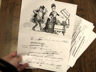
After composing each image, I like to print out each one to see how it looks on paper, then carry the papers around in my pockets for a while, scribbling on them whenever I come up with a scrap of verse. Taking walks is good for this — the rhythm of walking helps me think in poetic meter, but it’s also nice to be in front of a computer with rhymezone.com and OSX’s OED Thesaurus widget open.
It’s tough but fun coming up with explanations for all the weird images — some flow right out and others are a real challenge. Again, sometimes I’ll just start writing and see where it goes; other times I’ll get an idea for the gag or explanation for the image, and then have to work backwards to fill in all the details within the structure of rhyme and meter. When I think I’ve got something that makes sense, I’ll run it by a few other folks to make sure it tracks and makes sense — thanks are due to my wife Nikki and to Kris for late-night help at key points in this process!
The next step is to lay out each card for printing. I know there are neat calendar-generating plugins for InDesign and Excel templates you can download, but I didn’t use any of those because my life is made stronger by challenges. Kind Twitter volunteer @dharmakate helped lay out the grids and updated the dates for 2010!
Each year’s calendar has some sort of overall design theme — nothing specific, just an aesthetic that’s represented in the choice of fonts, layout of elements, etc. For example, here are some elements from the 2008 calendar:
…Which, because I like to make things new and better and not at all because I am obsessed with reinventing the wheel every single time I do anything (not at all, do you hear me), I changed the format to a slightly more modern look for 2009:
And now, for 2010, I decided to go more modern still — after years of immersion in the ephemeral art of the late 19th Century, I’m now starting to become fascinated by mass media from the 1910s, and I think this year’s design reflects that:
The use of flourishes and ornaments also allows some nice touches such as the crossbar of the ‘A’ in ‘August’.
Each month’s title, as well as the entirety of the title cards, will be printed in gold ink, and they can’t really be done justice by a graphic — they look really sharp. (The other printing is done in black ink — this year on natural-white linen cardstock.)
The calendar grids are all laid out in Illustrator. I use the amazing program Cocoapotrace to create vector versions of the final collaged images for each month, then place them on each card with their verses. The cards are each 8.5″ x 5.5″ (half of a standard US sheet of paper), but the GOCCO printer can only print on half that size — so the cards have to be laid out so that each element takes up no more than half the space. Each calendar grid, and each image/verse section, will be printed separately using its own screen. (Since the monthly titles will be gold, they’ll need their own screen as well. More on this later). But at this stage, for compositional purposes, I lay it all out as a unit, so I know how each final card will look — then I print these out to act as reference for the printing process.
Here’s the final card design for the image in the previous post. Tomorrow we’ll prepare to start printing!
Tomorrow: Part 3: The Gathering Storm
OBLIGATORY STORE REMINDER: Today (Tuesday the 15th) is the LAST DAY for guaranteed domestic shipping at my TopatoCo store. I’m still shipping calendars through Sunday in my own store, but they’re gonna arrive when they’re gonna arrive.


Hey, was that perchance the Emperor of San Francisco? (In the latest comic)
I’ve never actually heard of the program Cocoapotrace. Why not use Photoshop or something easier to use?
Cocoapotrace does one thing and one thing only: convert black & white raster images to vectors. And it does it AMAZINGLY well — better than Illustrator’s LiveTrace, in my opinion.
I use it to turn certain scanned (raster) images into vectors which can then be scaled infinitely, or inserted into a book as vector objects which will print super cleanly. For the calendar project it’s not a necessary step, but it’s how I ensured I’d get as clean a print as possible from my images. I’ll touch on this more in tomorrow’s post.