I’m turning some of my Victorian-style charts and diagrams into giant jigsaw puzzles! Update: The campaign is over now!
Check out this pitch video for more details!
I’m really excited about this project. The Hierarchy of Beards poster, and the Beards of our Forefathers book that birthed it, have led very exciting lives.

Pat Race (the photographer, not the subject, of the picture above) took a copy of the book around the World Beard & Mustache Championships in Alaska!

Reader Jonathan N. shared that his personal copy of the Beards poster had an uncredited cameo in an unrelated story about an unassociated legal dispute!
One of the made-up beard styles that I invented was adopted by a folk band in Winnipeg!
And I conducted a lengthy interview with the world’s foremost beard expert!
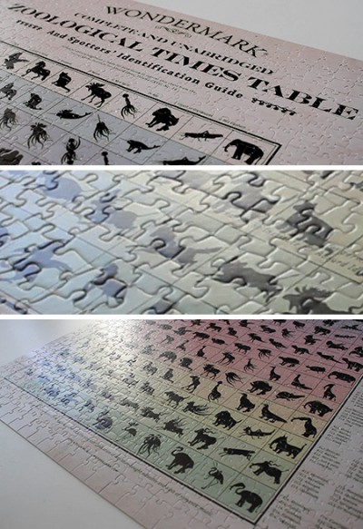
It’s amazing what one can accomplish in just a few years with a laserlike focus on beards. And I fully expect the Zoological Times Table to take its place in this amazing pantheon, in time.
Puzzles are to posters as ice cream is to milk.
Both are great. Both can be satisfying. But only one is typically enjoyed via a process — spooning, licking, sprinkling, coning, piecing, assembling, dipping in chocolate. Sure, milk can have a process too (I like a latte as much as anyone), but puzzles are process. And like ice cream, puzzles can be pretty cool!
While I wait for the Nobel committee to award me a Metaphor Prize for the preceding paragraph, I will say that I have always been very proud that Wondermark readers are intelligent and charming people with the most discerning taste. I have sold many hundreds of these posters over the years, always to nice people with good-smelling hands.
So you deserve more.
In my new campaign, I’m offering those same posters and books (at cheaper than my typical retail prices) — a great bargain for anyone.
But then you also get this new thing. A puzzle is something to do, not just something to see. A puzzle is a group activity; a puzzle is an art piece; a puzzle is a game that can be shared across generations.
Now, there is a place for super puzzle-maniac difficult puzzles; I don’t think these are they. These are really pretty puzzles that are totally normal puzzles like you would find in the store.
If my lovely Victorian-style joke-puzzles sound like something that would be at home in your life, or the life of someone you care enough about to give a gift to — I hope you’ll reserve your copy (or copies) now!
There are three designs available: The Hierarchy of Beards, the Zoological Times Table, and Sponsored Messages, chock-full of all the labyrinthine, intricate faux-Victorian classified advertisements I’ve been polluting my books with for years.
The Machine of Death game was a very complicated Kickstarter, but it is done now.
(You can buy the game now! You can also download the entire game for free.)
I learned a lot doing the MOD game! It was a giant Kickstarter that involved lots of complications — ultimately satisfying, but it took so very long to get settled! So following that, a thing I wanted to try, just to see if I could, was a project that would be deliberately simple.
Hence, the puzzles! In the campaign, you can also get books and/or posters, but that’s it. I will also be making videos along the way, if you’d like to check in on the updates.
So this is a bit of an experiment for me as much as it’s a product for you. Here it is! Puzzles! Grab ’em while they’re puzzly!
A special advisory for early backers: the first few batches out of the puzzle-fryer will still be chewy on the inside — I guarantee it.
You can wait, and get a puzzle later, and that’s fine…But it won’t have that flaky puzzle crust you’ve come to love. That’s not how I want my puzzles. Get ’em fresh. They’re better for you before all the nutrients get blanched out.
Wondermark’s Jigsaw Puzzles of Fictional Victorian Charts