I’ve been reading Garfield comics with my son this week.
He’s too young to really follow the narratives — after every strip he pauses, asks what happened, and then says, slowly and calmly, “Why” — but he’s already very fond of the drawings and characters.
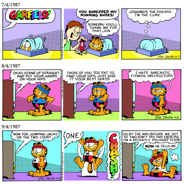
We’ve been reading specifically late-80’s strips, since those are the books we have handy. Honestly, I consider this period the creative zenith of the strip; it’s the sensibility that led directly to the Saturday-morning cartoon, which in my opinion still holds up.
I’d read and loved these particular strips as a kid, but haven’t revisited them much in the many years since. Reading them again now, I came to notice things I had never noticed before.
I posted all about it on Twitter yesterday, and thought I would record my thoughts here, too, for the record.
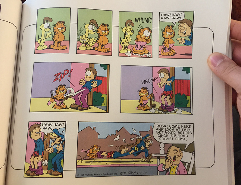
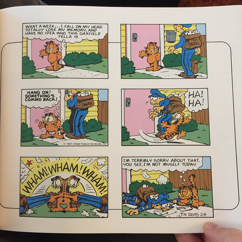
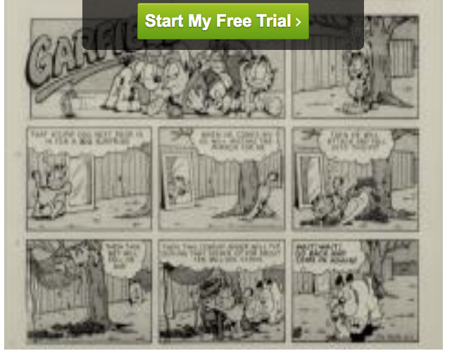
One thing Garfield doesn’t get enough recognition for is truly bonkers, impressionistic color choices. This sidewalk is pink and yellow. Jon wears purple pants. Every panel is like an Easter basket. (Click any image for a closer look.)
On, Twitter, Jim here replied with an observation that the current version of this strip in the Garfield online archive features different coloring:
The version of this strip on https://t.co/OqcQmIPcDh has more realistic pants and sidewalk color choices… but it also gives the Arbuckle house a purple floor. pic.twitter.com/nh9OIEIerB
— Jim Ellwanger (@trainman74) November 22, 2020
I find this fascinating — it means that someone, at some point, recolored it.
It makes me curious to know how this strip looked in the paper in ’87. A quick search of instances of the word “corset” in newspapers on September 20, 1987, gives us a clue:
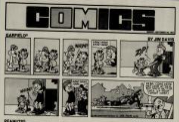
This is a low-resolution image from newspaperarchive.com. I can’t see the full image because I don’t have a paid subscription — because back when I did, I didn’t get anything else done.
It’s hard to tell, but it looks like Jon’s shirt is darker than his pants in the newspaper version — which means it’s more likely to have been colored like the version from my 1989 book, rather than the recolored online version.
It’s been noted before by other commentators that the rooms in the Arbuckle house are never any specific consistent color. The switching colors contributes to the ping-pong effect of the rhythm of the dialogue. The final panel here keeps the rhythm going while not being at all logical! Yet it works.
I’m being serious: it takes chutzpah to have, as a creative ethos, the theory “it doesn’t matter what color anything is, as long as it’s from the Cadbury brand palette.”
Below: is the house purple or yellow? Yes. Is the entryway green or pink (compared to the mailman strip above)? Yes.
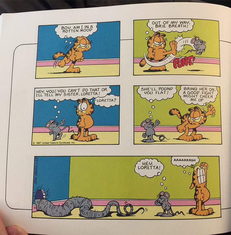
The ping-pong walls don’t appear when color is an important part of some other part of the strip. The static choices are still zany, though: yellow floors, pink baseboards:
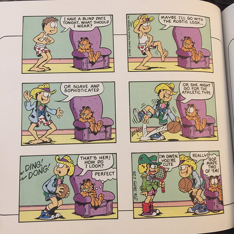
(Side note: I need more of Gwen, stat.)
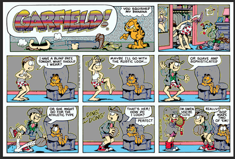
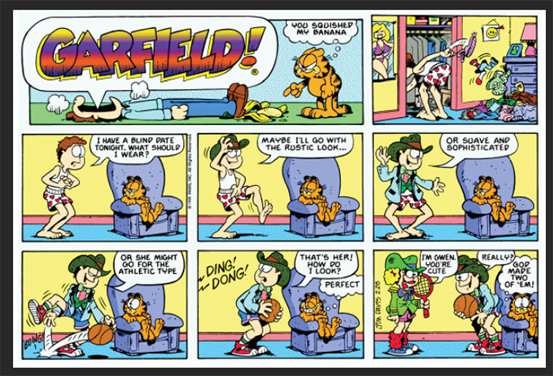
Here’s this Gwen strip from above as it appears now on GoComics. The colors are different, but decisions are still being made to make them as bold as possible.

The green of Gwen’s outfit, as seen here, can only exist online — which is to say, in RGB colorspace.
The gray in this graphic shows all the out-of-print-gamut colors (colors that wouldn’t be available on a standard printing press):
This is that strip converted to print-safe CMYK color, meaning, a version that would print just fine:
It still looks just as interesting, and is actually less abrasive to the eye.
Yet, someone at PAWS HQ (or somewhere) is deliberately coloring Garfield strips with super-bright colors such as R122 G255 B0:
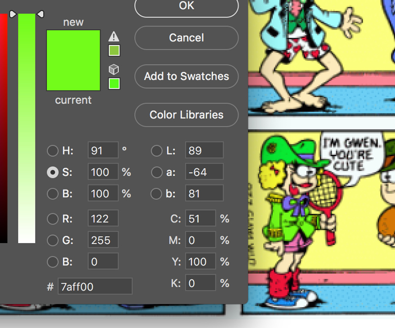
It’s just one of the many enormously bright colors in the comic — a color that won’t translate into print, and is much brighter than I think most people would choose to use for any sort of illustration (comics or anything else).
All the online Garfs from this era use these ultra-bright colors:
If you know the Garfield archive colorist, please buy them a drink. They probably need it.
Interestingly, newer comics don’t share this palette! It appears to be only the archives.
There seems to be a shift in style around the year 2000. The 1999 comics are all as bright as the above. The 2001 comics all look pretty “normal,” with a lot more prevalence of muted, darker, and/or desaturated colors.
2000 is a bit of a transitional year in the archive. The start of 2000 looks a lot like the archives, but by the end of 2000, things are looking more like the future. (Though there is still no consistency from comic to comic about the color of, say, Jon’s phone.)
This timeframe coincides roughly to the era when digital coloring began to become the norm, and cartoonists were beginning to submit daily strips already pre-colored to their syndicates (rather than letting individual papers color them via manual means).
So it’s more likely that color versions were already complete and backed up from that point forward, whereas the older black & white comics likely had to be colored from scratch (or recolored, in the case of Sundays) if they wanted to present an entire archive that was in color.
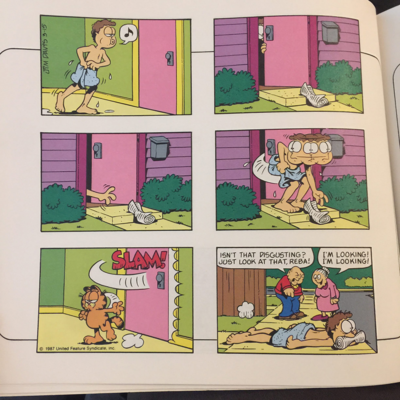
Back to the 1989 book: this dog is one of the very few white (uncolored) things in the whole book.
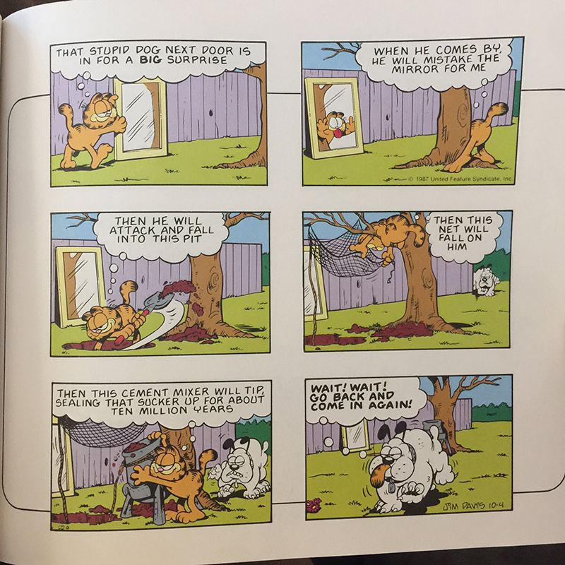
Note how the concrete is brown, though — a weird choice.
I suspect the entire book was colored from B&W art separately from how they appeared in papers. The whole book is probably colored from the same 20 swatches.
The notion that a strip might have been colored differently from paper to paper opens up a whole new world of imagination:
Re: coloring, in 1987, coloring for dailies was not common and was often done by pagination/production houses so could vary from paper to paper.
— Tea Berry-Blue (@teaberryblue) November 22, 2020
For the online version, they fixed the color of the cement in the dog strip, but made some other, very curious, choices, such as a profusion of bright pinks:
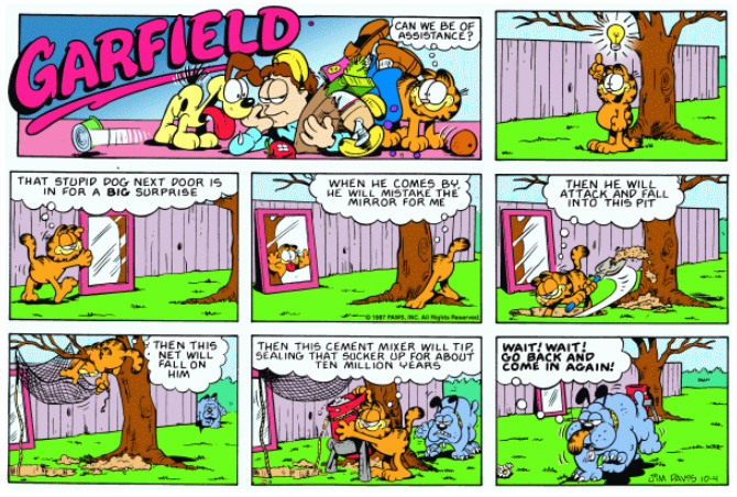
Preliminary research suggests that the version of the strip that ran in (at least some) papers was probably closer to the book version. Note how dark the cement looks, even in this preview:
(I found this page in the archive by assuming, correctly it seems, that it would be one of the only places the word “sucker” would appear in most newspapers on October 4, 1987.)
The part of all this that fascinates me the most is that, when the decision was made to color the comics for the online archive, someone seems to have considered — and then answered in the negative! — the question of whether or not to look back at the previous versions for reference.
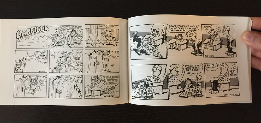
One thing I never specifically noticed until now is that the little Garfield books collect the longer Sunday strips, complete with the first two “throwaway” panels.
They’re not colored at all, and you can see how they suffer visually compared to the strips intended to print as B&W (full of spot blacks & halftones):
The color book, however, which is a collection of all Sunday strips, omits the throwaway panels of all the strips — when you’d think that a book would want to present the complete material, not truncated versions.
This is curious to me, because it implies a priority other than presenting absolutely every bit of the content.
My big takeaway from all this for cartoonists is that your work doesn’t necessarily have to have an “official, canonical” version. The same work can be presented in different ways depending on the context.
I suspect that newspaper cartoonists who knew that 1/3 of their strip might get lopped off, or the panels reshuffled, from paper to paper may have a more inherent understanding of the work itself as being modular.
One final observation here is that perhaps I have been far too conservative in coloring Wondermark, when I have made color versions of the strips for my own books.
Here is comic #378 as it appeared in a book, colored by Philip Obermarck, which is lovely — but here is ALSO a proposed version that I did not publish (submitted by Erica Franzmann):
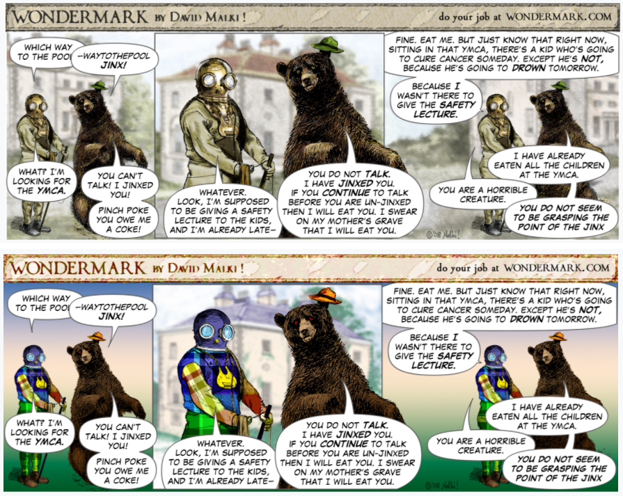
This could be a whole new horizon for Wondermark!