How to Make a Calendar, Part 5

Now Put A Bow On It

Continued from Part 1 / Part 2 / Part 3 / Part 4

Although the printing is complete, and the room no longer smells like denatured alcohol & paint thinner (except for the splash I’ve added to my coffee for a little pick-me-up), there’s a bit more to be done before the calendars are Formally Finished. Once the covers are signed and numbered, all the cards are collated into sets and double-checked to make sure nobody’s getting two Augusts or getting shorted a February. Although I do want to sow a sense of existential ennui among the populace at large, we now have too many external calendar systems for any minor rebellion here to be tremendously effective, and I will save my efforts in that realm for more grandiose schemes.

Last year, we collated the cards by setting the stacks around a table and then continually circling the table over and over, picking up a card from each successive stack like it was the world’s most obsessive comic-convention freebie table. That was a very dizzy way to do things. This year we just kinda put them in a long row and then walked down the row a bunch of times.

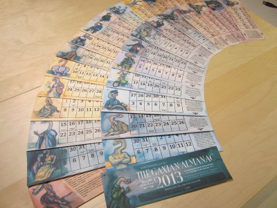
With the cards collated, they’re then SEALED FOR YOUR PROTECTION into little capsule units that can be thrust headlong into our shipping workflow:

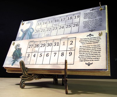
And these, along with the easels if desired, are what customers get! We spent the full day yesterday packaging and shipping, and I’m pleased to announce both that: all pending pre-orders have been sent, and all new orders are shipping out immediately. As of this writing, less than two dozen copies remain. Please, if you’ve been on the fence about ordering, don’t delay — I’d hate for you to miss out. UPDATE: You guys are too much. They are all gone!

(I will also be a little sheepish here and say that if they sell out while I’m asleep tonight, and I’m unable to update the store in time, please forgive me if I have to write an apologetic email. Hopefully this won’t happen.) ack

That buzzkill aside! I am so tremendously pleased with how this whole process has gone that I can hardly tell you. (Though you cannot fault me for trying.) Whether you buy a calendar or not, whether this has inspired you to make anything creative of your own or not, whether you’re even the least bit interested in this process or not, I hope you take one key thing away from this entire, long-winded story. I’ll put it on its own line and bold it so you’re sure not to miss it:

You can make something from nothing.

Let me repeat that. You can make something from nothing. The Wondermark Calendar is not a model kit that we assembled from directions. It’s not a box of LEGO® brand interlocking building blocks that we dumped onto the floor and then very precisely made into a spaceship. The LEGO® brand interlocking building blocks that we used were paper and ink. Any meaning that they have been given is meaning that we have fabricated.

You can do this too. I’m not saying you should necessarily make a calendar, or start hunting eBay for a GOCCO, or anything so specific — I’m saying that the tools and the effort and the materials and the sweat that went into our project are nothing my wife and I have a monopoly on. They are not hard to fathom nor out of reach. It just takes work: exposing yourself to ideas, swishing them around with other ideas and original notions, being a bit of a perfectionist at times, and just working at it. I know I’m never so satisfied with my job as when I sit down and make things that used to not exist.

(click)

I’m going to stop there; you can run with that ball anywhere you like, or leave it be, as you prefer. I just think it’s neat that there was nothing and then I had some cockamamie idea and figured out where to buy paper and stuff and then, a bunch of man-hours and problem-solving later, there is something. This is a thing we wrestled into existence. If you buy one of our things, you will be getting a tidy little package made of paper, ink, brass, and force of will.

If this calendar stays in your house, in the most quiet stillness of an afternoon when everything is at an ebb — if you get very close, close enough to see the fibers and detect the thin mounding of the ink over the paper — and if you hold your breath and if your refrigerator isn’t on and if the pets are all napping and nobody’s trying to email you right then —

— If the rest of the world is silent, and if the light catches it just perfectly right, I do believe you will see this thing’s heartbeat.

Thanks very much for all your kind attention this week, and for your wonderfully flattering patronage. While I was writing this, I went back and checked and it looks like one more has sold. I am serious. Get one now, if ever. UPDATE: They are gone, compadre. Wowsers.


That being said, I understand that this isn’t for everyone, and to those folks, sorry for hammering on this point all week. Thank you, regardless — I will make other things, on other days, for free most of the time, and presumably you will be able to share in those. It’s been a fun week but it ain’t over yet so now I am going to go to bed.

How to Make a Calendar, Part 4

Printing Pluperfect

Continued from Part 1 / Part 2 / Part 3

With screens prepared and supplies obtained, it’s time to print! Each screen is inked (above), affixed to the GOCCO, and THE PRINTING BEGIIIIIINS

One new challenge we had this year with the thermofax screens was the concept of cleaning and re-using the plastic frames. At the end of a run, the screens typically end up looking like this:

With the help of magical chemicals, we scrape and clean the ink off each frame, the mesh screen itself gracefully retired with the dignity due a hero whose job has been completed with honor (i.e., it’s tossed into the trash). Then, using several flavors of tape and tape-like compounds, a new screen is affixed to each frame! THE CYCLE BEGINS ANEW.

To be quite honest, this is a messy, time-consuming and smelly part of the process, and for those considering doing a similar project, definitely consider having all your screens mounted on separate frames ahead of time. It might be a much smarter use of time and energy than cleaning all these ridiculous little frames and running out to get more double-sided tape and cursing the heavens because a screen was adhered slightly crooked because you are not as good at doing this as someone who has set up a business doing it and has likely done it many more times more than you have. Takeaway business advice: Delegate, delegate, delegate.

Still, time-consuming or no, the method does work! Using just those six frames, we successfully printed 38 screens’ worth of designs onto over two thousand individual cards.

Now comes the fun part!

Every single calendar is individually signed and numbered. And they’re sent out in order, so the later you buy, the higher number you’ll get in the series. Do people care about getting low numbers? I’m not sure. Anyway, if you do, time’s a-wastin’! As of this writing (Thursday morning), over half of the run of 150 have been sold, which means that the very lowest numbers are already gone — but there are still calendars available, which there won’t always be, and they’ll be shipping out as quickly as possible all the rest of this week with love and kindness included at no extra charge.

Most places charge extra for that! Or they bury the kindness cost in suspicious “handling fees”. We guarantee all our kindness is certified organic and hormone-free. It will absolutely not gum up the inside of the shipping envelope. (We have learned our lesson about that.) Seriously, it is good.

If you haven’t ordered yet, won’t you consider it? We have been working hard all month on something that you can enjoy all next year!

And to those who have ordered: thank you so very much! SHIPPING BEGINS TO-FREAKING-DAY


Anyway there is still ONE MORE PART TO GO!
Tomorrow: Part 5: Putting It All Together

How to Make a Calendar, Part 3

Supplies & Demand

Continued from Part 1 / Part 2

What do you need to make 150 calendars made of 14 cards each? Why, 2100 blank cards, of course!

I’m fortunate to have a wonderful paper store right in my neighborhood — Kelly Paper has some of the nicest, most knowledgeable staff around, and I love going in there and browsing their huge aisles full of paper stock. They also have overnight cutting services, so once I found the paper I wanted for this year’s calendar (a forest-green laid correction: linen for the covers and a natural-white linen for the interiors), I just told them how many sheets I wanted at what size, and they had it all nicely packaged and ready for me the following morning.

Also, I did the math wrong and ordered twice as much as I needed! THAT IS OKAY. I can always use nice paper for something. Maybe I will start doing daily sketches. It could be a New Year’s resolution.

BUT I GET AHEAD OF MYSELF

I also need easels! Two years ago, when I got the first batch of easels, I looked at a lot of styles before settling on this one — they’re bronze, hand-made in India and finished in either this dark coppery color, or in antique gold or pewter. They’re super-handsome, and all three colors go equally well with the rich palette of the calendar. I’ve toured the local office of the manufacturer/importer and spoken with the head dude in the U.S., and he explained how a portion of the proceeds from their easels go towards scholarships for kids in New Delhi. I am okay with that!

Perhaps by now you are getting a sense of how particular I am about every facet of this process? It’s why I’m sure you’ll be pleased with the calendar — because every dang piece of it has to pass through my super-fine high-mesh perfectionist-filter before I am satisfied. It makes for a tense existence but wowsers does the stuff come out excellent.

Next, it’s time to stock up on supplies for the ol’ GOCCO printer:

If you’re not familiar with Print GOCCO, it’s a Japanese screenprinting apparatus, popularized in the 1980s, that has since has been embraced by the modern crafting community. It’s easy to use and produces really cool, artisanal work — much more interesting than a computer printer can create, without being as complex or expensive as letterpress. You can read more about the history of GOCCO here!

The GOCCO uses several expendable supplies: ink, screens, and bulbs (used to create the screens). The screens and bulbs look like this:

how bulbous

Each screen is a fine mesh mounted on a cardboard frame. Typically the way it works is:

• You draw or print out your image.
• You make a photocopy of the image (to reduce it to pure black-and-white, and also there’s something special about copier toner that’s reactive with the screen).
• You place the photocopy and a blank screen inside the GOCCO and expose them to heat using the bulbs.
• The heat burns through a coating on the screen at the point of contact with the toner.
• Your screen is now “imaged” and ready for printing. When ink is pressed against the screen, it’s forced through at the burned areas, and makes an inked impression in the shape of your design.

Here’s a video I made a couple years ago showing some of that process.

So! All good, right? Wrong. See, the Japanese factory that manufactures the screens and bulbs has closed down due to the rising cost of materials and falling Japanese demand for the supplies! This has created a frenzy in the GOCCO community, and it’s made screens and bulbs hard to come by and expensive. Since we use 38 different screens for our calendar (plus mess-ups), and each screen requires spending two bulbs, this scarcity nearly sunk the project this year. (Thankfully the inks are still plentiful — for the moment at least.)

But never underestimate the cleverness of crafters! Folks have realized that there is an alternate way to image these screens: by feeding the coated mesh through a thermofax machine, which can “print” onto a screen using heat in the shape of a given design! HOW CLEVER. This handily eliminates the need for bulbs at all.

The screen fed through the printer must be loose and unmounted (on a roll), so it’s also necessary to mount the screen to frames that will fit the GOCCO. A crafter named Amy first tried doing so with cereal box cardboard, until discovering that an enterprising German fellow has started manufacturing reusable plastic frames specifically for this purpose!

Here is the takeaway business lesson: Find a niche of obsessive hobbyists that needs some goofy, super-specific thing that nobody else is bothering to provide, and provide it.

Because I wasn’t about to buy a thermofax machine, I contracted Amy to print my designs onto screens for me, and mount a small set of them onto the reusable frames. She did a great job! Here’s what they look like:

This was a much easier process than burning through hundreds of dollars’ worth of screens and bulbs at home! And I feel better about the lack of waste that the process generates, too. It does mean that everything I sent her to print had to be perfect, and it does mean that there is some messy, inky cleaning involved in re-using the frames, but those have proved to be very manageable concessions.

As described in Part 2, each card requires three separate screens — one each for the calendar grid, month title, and image/verse. I vectorized each illustration using Cocoapotrace so I could send Amy a PDF with 100% vector images — never having used the thermofax process before, I wanted to make sure we’d get the cleanest possible prints. I’m happy to report that they all turned out great!

This amassing of supplies — just the mechanics of choosing and ordering the paper, ordering the ink, having the screens made, etc. — takes a week or so, but once it’s all done, all that’s left to do is PRINT.

And that’s what we’re going to do — in tomorrow’s post!


Tomorrow: Part 4: Print That Baby


OBLIGATORY PLUG: Buy the calendar here!

How to Make a Calendar, Part 2

Writing (and more design)

Continued from Part 1

After composing each image, I like to print out each one to see how it looks on paper, then carry the papers around in my pockets for a while, scribbling on them whenever I come up with a scrap of verse. Taking walks is good for this — the rhythm of walking helps me think in poetic meter, but it’s also nice to be in front of a computer with rhymezone.com and OSX’s OED Thesaurus widget open.

It’s tough but fun coming up with explanations for all the weird images — some flow right out and others are a real challenge. Again, sometimes I’ll just start writing and see where it goes; other times I’ll get an idea for the gag or explanation for the image, and then have to work backwards to fill in all the details within the structure of rhyme and meter. When I think I’ve got something that makes sense, I’ll run it by a few other folks to make sure it tracks and makes sense — thanks are due to my wife Nikki and to Kris for late-night help at key points in this process!

The next step is to lay out each card for printing. I know there are neat calendar-generating plugins for InDesign and Excel templates you can download, but I didn’t use any of those because my life is made stronger by challenges. Kind Twitter volunteer @dharmakate helped lay out the grids and updated the dates for 2010!

Each year’s calendar has some sort of overall design theme — nothing specific, just an aesthetic that’s represented in the choice of fonts, layout of elements, etc. For example, here are some elements from the 2008 calendar:

…Which, because I like to make things new and better and not at all because I am obsessed with reinventing the wheel every single time I do anything (not at all, do you hear me), I changed the format to a slightly more modern look for 2009:

And now, for 2010, I decided to go more modern still — after years of immersion in the ephemeral art of the late 19th Century, I’m now starting to become fascinated by mass media from the 1910s, and I think this year’s design reflects that:

The use of flourishes and ornaments also allows some nice touches such as the crossbar of the ‘A’ in ‘August’.

Each month’s title, as well as the entirety of the title cards, will be printed in gold ink, and they can’t really be done justice by a graphic — they look really sharp. (The other printing is done in black ink — this year on natural-white linen cardstock.)

The calendar grids are all laid out in Illustrator. I use the amazing program Cocoapotrace to create vector versions of the final collaged images for each month, then place them on each card with their verses. The cards are each 8.5″ x 5.5″ (half of a standard US sheet of paper), but the GOCCO printer can only print on half that size — so the cards have to be laid out so that each element takes up no more than half the space. Each calendar grid, and each image/verse section, will be printed separately using its own screen. (Since the monthly titles will be gold, they’ll need their own screen as well. More on this later). But at this stage, for compositional purposes, I lay it all out as a unit, so I know how each final card will look — then I print these out to act as reference for the printing process.

Here’s the final card design for the image in the previous post. Tomorrow we’ll prepare to start printing!

Tomorrow: Part 3: The Gathering Storm


OBLIGATORY STORE REMINDER: Today (Tuesday the 15th) is the LAST DAY for guaranteed domestic shipping at my TopatoCo store. I’m still shipping calendars through Sunday in my own store, but they’re gonna arrive when they’re gonna arrive.