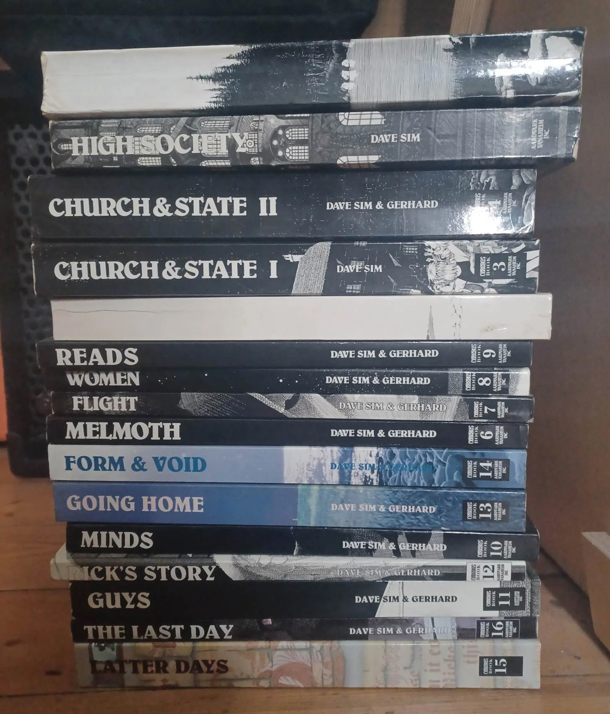
If you, like me, haven’t read all of Cerebus, but are curious what actually happens in those last few books, good news: Tom Ewing has your back, in a book-length series of blog posts.
So here’s a way of thinking about the comic aside from as a 300-issue story. It’s not really one overarching narrative, it’s three overlapping long narratives, which share some of the same material. Pick the one which holds most interest for you…
The first Cerebus is an epic satirical fantasy…
The second Cerebus is a domestic drama about a man and a woman who are unable to be happy apart or together…
The third Cerebus is a highly experimental philosophical novel about the political, moral and theological journey of a writer, Dave Sim, and his creation, Cerebus, as they first explore relationships between men and women and later come to comprehend the divine implications of this initial understanding.
Like many people who were reading comics during the 1990s and 2000s, I have an awareness of Cerebus, the epic 300-issue saga widely acknowledged as one of the most monumental achievements in comics by a singular creator (which is not to minimize the contributions of his artistic collaborator, Gerhard).
I may have read a few issues of it at some point; I definitely had a copy of some crossover comic Cerebus (the titular aardvark character) featured in. They were lousy on the ground, in the ’90s.
But about the content of the comic itself, I only really ever knew the following:
- The creator, Dave Sim, was well-known to be a fierce champion of independent publishing and creator’s rights.
- Cerebus began as a parody of Conan, but then came into its own as an original story. It even inspired the term “Cerebus syndrome,” which is when a lighthearted story turns serious and dramatic over time.
- It featured some of the greatest panel compositions, lettering, and other markers of craft of any comic of the time — or possibly ever.
- It went totally off the rails midway through, and the last third is basically unreadable.
Given its reputation, I’ve always been curious about its whole “deal,” but reading it seemed impossible (it’s thousands of pages long), with the implied threat that “It won’t be worth it, because of how bonkers it gets.”
So I really enjoyed reading — in many sessions, over the course of weeks — Tom’s 19-part blog series that both summarizes the story, and provides a lot of interesting flavor and context.
Having read it, I now feel, if not fully informed, at least that my curiosity has been satisfied. I’m “caught up” exactly to the degree that I want to be. I recommend Tom’s series!
There is another, slightly weirder way in which Dave Sim and Cerebus connect to my own work.
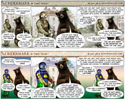
Sim spent several years post-Cerebus, during a time in which he suffered a wrist injury and couldn’t draw traditionally, making Wondermark-style comics featuring the Cerebus character:
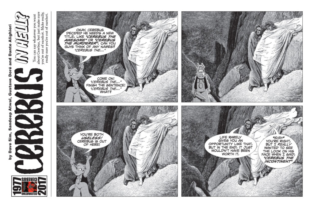
By which I mean, he placed stock drawings of Cerebus over public-domain vintage line art, and added repartee.
It’s called “Cerebus in Hell” and when I call it “Wondermark-style,” I’m not being hyperbolic. From an essay of Sim’s about his original idea for the strip:
…I went to my bookcase to try to find something Funny to read, Laughter being the best medicine as the Reader’s Digest assures us (like THEY would know).
It was a toss-up, my personal “funniest options” being Stephen Notley’s BOB THE ANGRY FLOWER collections: 1) COFFEE WITH SINISTAR or 2) IN DEFENCE OF FASCISM (you can see that Stephen and I share a warm affection for career-immolating guy humour) and 3) David Malki’s THE BEARDS OF OUR FATHERS Wondermark collection.
[It’s actually Beards of our Forefathers – DM]
[…] It’s basically a collage of late 19th century, early 20th century engravings with High Ironic modern word balloons and captions. Partway through, I had my eureka moment… “I can steal this concept and David Malki will never find out.”
In 2016, when he first started Cerebus in Hell, Sim described the same thought process in a blog comment:
Actually this all started with David Malki’s WONDERMARK collection THE BEARDS OF OUR FOREFATHERS which (I think) Margaret sent to me. I had a weird flu over Christmas and I wanted something FUNNY!!! to read. Not funny or “funny”. FUNNY!!! By the time I got to the cat with the online blog I was thinking “I need to do something like this.”
And then when Dave Fisher was scanning the first box of my correspondence — picked at random — there was David Malki’s first collection and a nice letter from him asking for a quote.
Didn’t even remember it coming in!
There’s a third account of this too, in an interview with CBR.
This is a bit awkward for me, the David Malki in question, because — if you aren’t aware — Dave Sim has a very particular reputation related to his personal beliefs, which might be characterized as Most Divorced-Guy Energy Of All Time, Plus Possibly Schizophrenia.
Wikipedia charitably summarizes this as: “In the course of writing Cerebus, Sim expressed opposition to feminism and made controversial statements regarding men and women.”
Today, or back in 2016 for that matter, he’s not a creator I feel particularly comfortable being associated with.
But is his comment true?
Did I, in fact, write Dave Sim a nice letter?
I did, over 20 years ago. Here’s how it happened:
In late 2004, I printed up (“published” would be too strong a word) my first Wondermark book, the now-out-of-print The Annotated Wondermark:
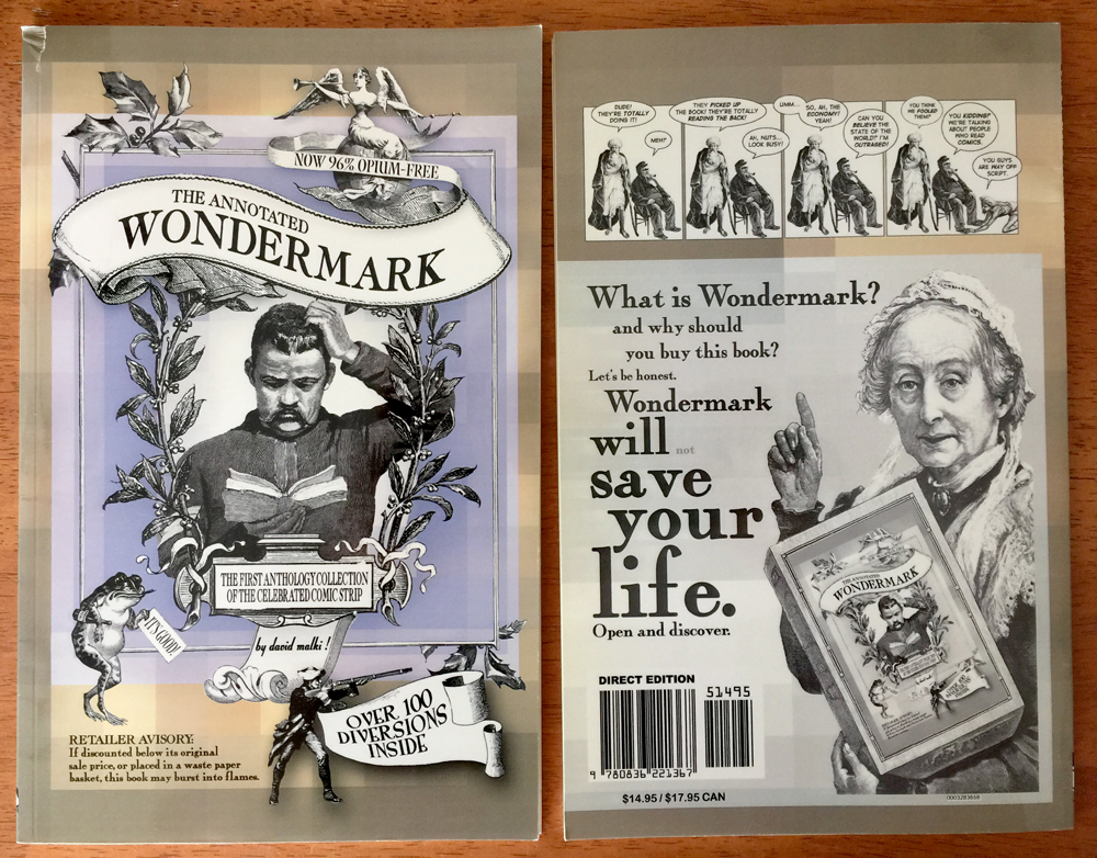
It was very early in the life of Wondermark. I was just starting out. I didn’t really know what to do with the book. I mailed copies to a bunch of famous people, as I wrote about in more detail here:
I made an initial run of about 100 copies and solicited them office-to-office at the ad agency where I worked at the time. Almost everyone good-naturedly bought a copy (with the exception of the unpleasant producer who asked if this was “more of that Trader Joe’s stuff”).
Around the same time, I decided it would be a good idea to send copies of the book to anyone slightly famous that I could dredge up any remote personal connection to.
At the time (late 2004), Neil Gaiman was in regular contact with Dave Sim, who was developing a reputation as, among his other quirks, a sort of Luddite crank. (Sim still communicates with the blog I quoted above by sending them faxes each week.)
On Gaiman’s own blog, which I occasionally read at the time, Gaiman posted a challenge he’d received from Sim, in which the latter basically dared people to send him letters:
Dave wants to know (as, I have to admit, do I) how many of the people out there in internet-land will actually go and do things that don’t involve passively clicking on a link and going somewhere interesting. So what you have to do is write Dave a letter (not an e-mail. Dave doesn’t have e-mail) telling him that you read that he’ll send you a signed Cerebus, and telling him why you’d like him to send you a copy. It’s as easy as that.
So of course, I wrote Dave Sim a letter. And I enclosed my book.
Here’s where it gets weird.
The book, brazen young author that I was, contained a challenge of its own, in the introduction that I wrote:
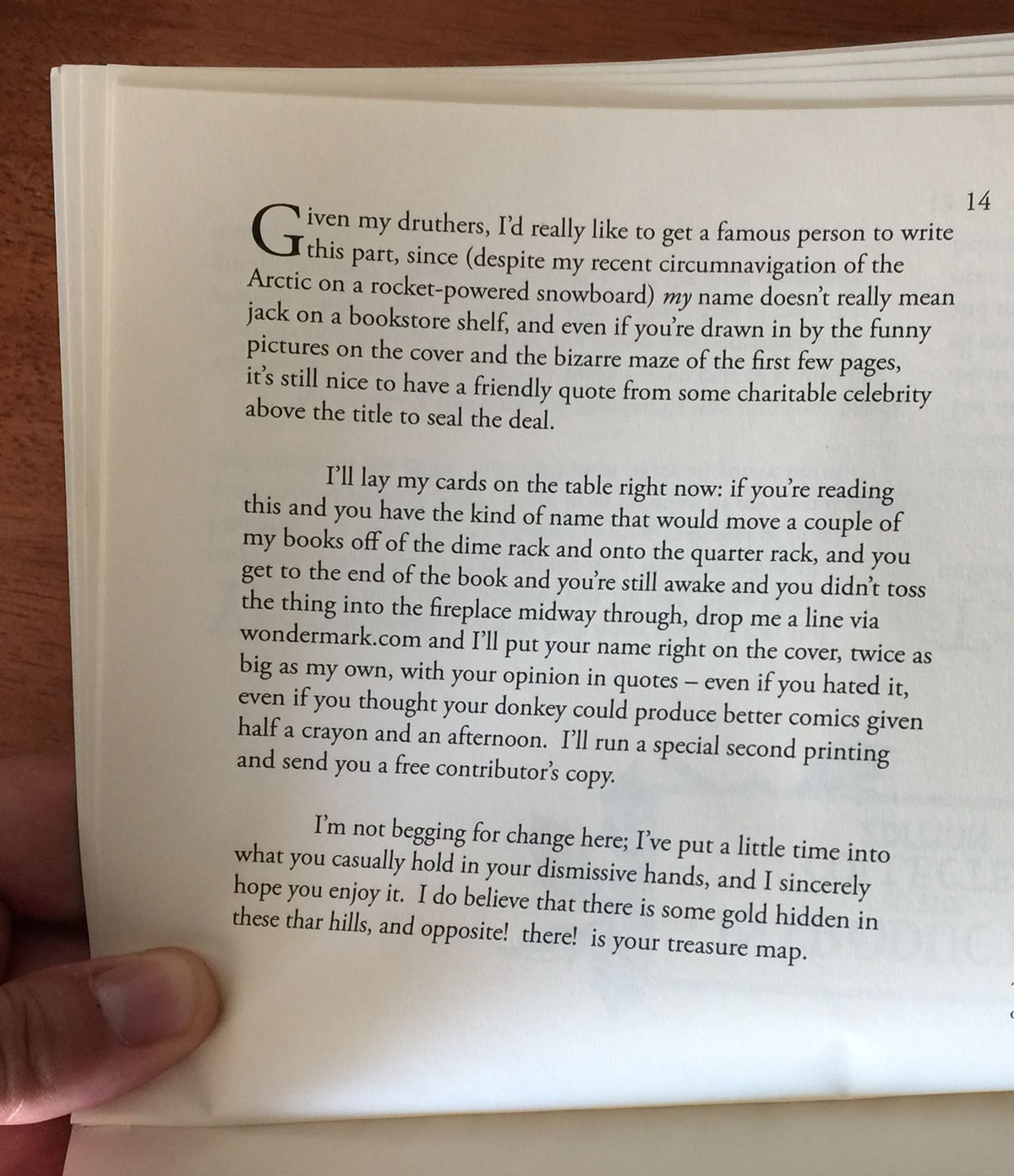
Dave Sim read the book, including my challenge above, and he replied, sending me a quote for the book as I had requested.
Here is his letter to me:
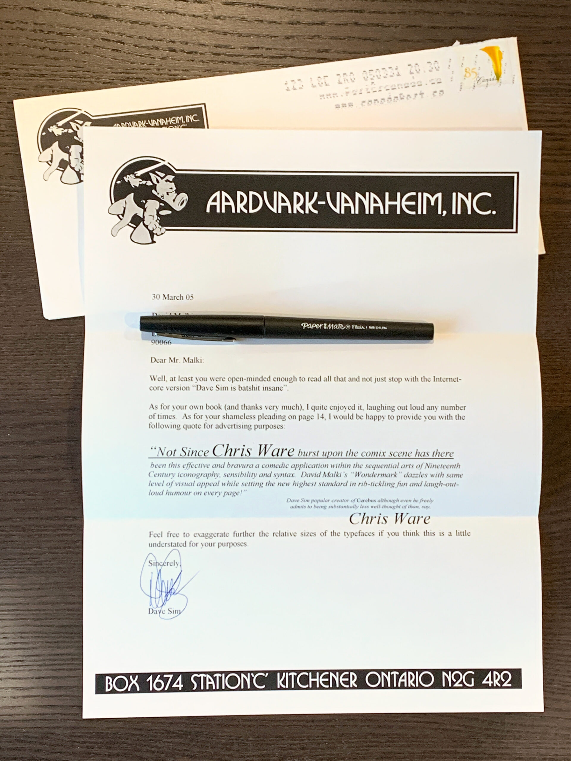
Dear Mr. Malki:
Well, at least you were open-minded enough to read all that and not just stop with the Internet-core version “Dave Sim is batshit insane”.
[I don’t remember what exactly I wrote to him initially that he’s referring to here. – DM]
As for your own book (and thanks very much), I quite enjoyed it, laughing out loud any number of times. As for your shameless pleading on page 14, I would be happy to provide you with the following quote for advertising purposes:
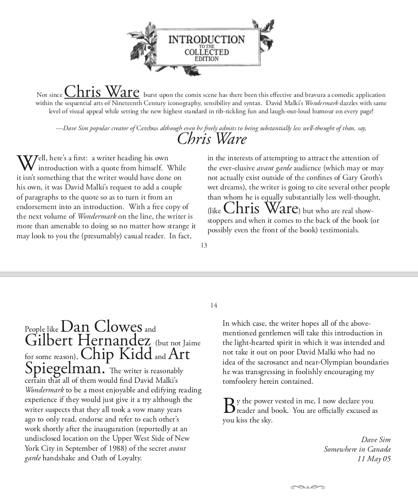
“Not since CHRIS WARE burst upon the comix scene has there been this effective and bravura a comedic application within the sequential arts of Nineteenth Century iconography, sensibility and syntax. David Malki’s “Wondermark” dazzles with same level of visual appeal while setting the new highest standard in rib-tickling fun and laugh-out-loud humour on every page!”
— Dave Sim, popular creator of Cerebus, although even he freely admits to being substantially less well-thought of than, say, CHRIS WAREFeel free to exaggerate further the relative sizes of the typefaces if you think this is a little understated for your purposes.
Sincerely,
Dave Sim
I replied back to him, saying in essence, “Thanks, and this is so long of a quote it’s basically one paragraph away from being a full introduction. Would you be willing to add a bit more?”
This, he did. And so the second printing of The Annotated Wondermark contains Sim’s introduction:
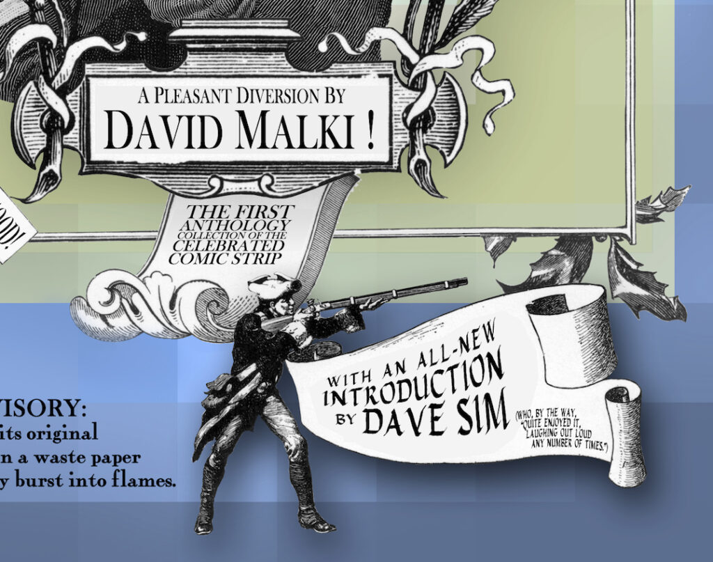
I printed just a handful of copies of this second edition. 2005 is when I started to make actual friends in comics, which brought me more perspective on what it would mean to have Sim’s name on my book.
So I printed no more and instead solicited another new introduction, this time from my new pal Ryan North, and most copies out there in the world of this book are the 3rd edition.
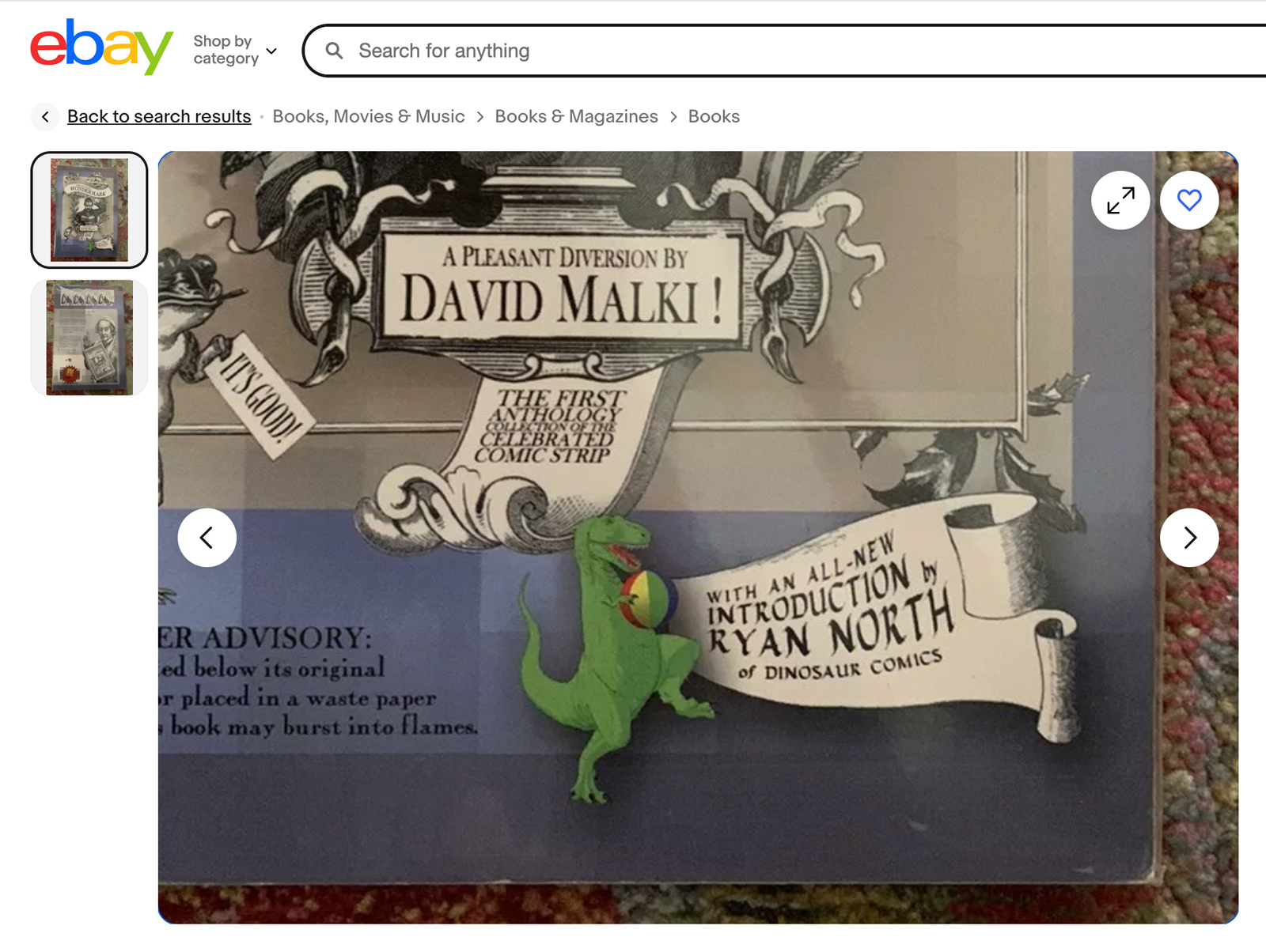
(In 2009, I completely reformatted this book once again, but retained the Ryan intro.)
Just one thing remained.
I had promised another free book to whoever wrote me an introduction.
By the time my next book came out — 2008’s Beards of our Forefathers, which got a proper release from Dark Horse — Sim had adopted a new policy for correspondence.
Mail was still his preferred mode of communication, but he had started replying with form letters:
…If you want a response to your letter or submission all you have to do is return this form letter stating for the record… “I don’t believe that Dave Sim is a misogynist.”
If you aren’t willing to extend that minimum courtesy to me, then I would respectfully ask that you not attempt to contact me in the future.
I had no intention of complying with this weird requirement, so I didn’t expect a response, but I did want to honor my side of the bargain, so in early 2009, I mailed him a hardcover of Beards along with a short note.
No form letter was enclosed, and indeed, no response was received. But apparently, he read the book.
And that, I assume, is how it came to be on his shelf, and why the world has me to blame for “Cerebus in Hell”.
The whole form letter premise (if you read the whole thing) is Sim asserting that he’s unwilling to expend energy interacting with people who don’t respect him, or more pointedly, who won’t defend him.
Which I suppose is his prerogative. I’ve no particular interest in crawling out on any limbs for him myself, so yes, even I, recipient of his glowing compliments, am one of the many who “refuse to” defend him (or simply don’t have much to say on the matter — aside from this lengthy post, of course).
But as I see it, our balance sheet is even: He did me a favor, by providing the quote; that was genuinely a nice thing for him to do for some rando, which I was (and remain).
He then got something in return, which was the inspiration Wondermark gave him for Cerebus in Hell.
I think we’re square.
He may see this post, which I’m okay with. I’m glad that he likes Wondermark, or at least liked the books that he read, the same way that I’m glad anyone likes Wondermark.
I’m also pleased and flattered that he continually gave me credit for his inspiration.
In case anyone wonders, I have no “objection” to Cerebus In Hell; I’m certainly not the first person to do this weird collage-thing, nor have I been the last. (Private aside to Scott of DDT, if you read this: Would you please email me? I have a question.)
But neither do I think Cerebus in Hell is all that good. That should be okay to say, too.
It’s possible the collage bit is over, now; last year, one of the Cerebus in Hell printed issues (an Akira parody) was solicited as “the first hand-drawn Sim comic in years.”
So what I take away from it all is this:
I can’t believe I outlasted Dave Sim at something involving comics.


