My new game, TBH, has now reached its minimum funding goal on Kickstarter!
We’re working on stretch goals now, to make the game even bigger and better. The campaign runs through the end of April, and I hope you’ll check it out!
If you visit the page, you’ll see my face halfway down, hosting a “How to Play TBH” video that I shot in my living room.
But otherwise, the campaign is run by a company called Cut. (I mean, truthfully it’s run by me behind the scenes, but I’m doing it for Cut.)

I started working on this game back in the summer of 2020. Cut is a YouTube channel, and they have a series called Lineup that’s all about guessing things about strangers.
I’ve been working with Cut for a while now, advising on their development of a merchandise arm, and TBH the game actually came out of a pitch for a Lineup episode.
It was sparked by the idea of having not just one guesser, but rather, having all the participants guess on each other.
From there, we started playtesting a serious version of the game, all about moral dilemmas. One player would pose a dilemma, and there would be conversation as everyone tried to figure out how the others would answer.
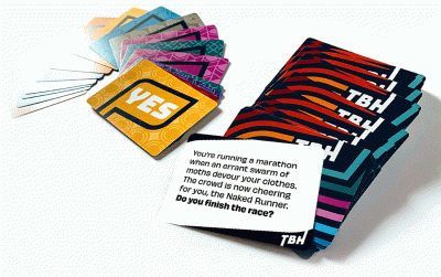
But… There’s a mechanic where the player gets to draw two prompt cards (“Dilemmas”), and then chooses which one to ask the group.
What we noticed rapidly was that players reliably chose the weirder option.
So, we decided to make the game weird.

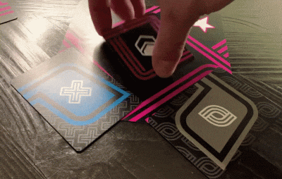
The game works like this:
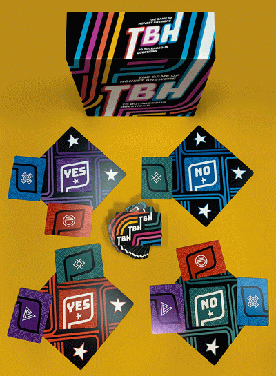
• One player draws the card and poses the dilemma to the group. They are the Dilemma Boss.
• The other players all ask clarifying questions about the dilemma. This is the fun part — where the Dilemma Boss gets to make up whatever answers they want.
• Once everyone’s satisfied that they know enough to answer the question, they secretly answer YES or NO for themselves.
• Everyone then guesses how the other players answered. You score points for guessing right!
(Here’s me saying all this in video form too.)
The scoring and guessing is fun, but the real joy is the questions, answers, and the group storytelling that results from it.
Every group takes the dilemmas in different directions. In-jokes are developed. Surprises occur.
In a time when we have been seeking new forms of connection — tired of the same old “how’s it going for you” conversations — it turns out we actually have lots to talk about, if we just start making stuff up.
And yet, somehow, by doing so, we find that the game uncovers real truth and honest conversations. It’s something of a magic trick.
And it’s really, really fun. We’ve been playing this game basically nonstop for months now, as we’ve been testing the prompts. It’s fun every single time.
I’ve been fortunate to assemble a crack team of creative superheroes to help with this game:
• Co-creator Nate Weisman, formerly of Funko games
• Graphic designer Alexandria Ferri Land
• Project manager & writer Sara McHenry
• Videographer & writer Zachary Sigelko
• Writers Maddie Downes, Lisa Wallen, Grace Freud, Daniel O’Connell, Billie Bullock, & Trin Garritano
You may or may not know those names, but rest assured they are a rogue’s gallery of greats. I couldn’t (wouldn’t!) do this by myself, and I sure haven’t this time.
If you like the weirdness of Wondermark, then I recommend checking out TBH.
Kickstarter copies of the game will be shipping out later this summer (just in time for party season to return, we hope), but also, we have an online version you can play via video chat right now! There’s a link to that on the Kickstarter page (look for “Play it Now”).
I’ll have even more on TBH soon. But here’s an account from Trin, one of the writers, which I loved to read:
I remember going to my first TBH writers meeting and thinking, “David Malki hand-picked the most interesting, talented weirdos from the internet to make a party game and somehow I am also here.”
And then after a while I realized on top of that, they’re also thoughtful and kind.
Thoughtfulness is uncommon in party games. I do not feel comfortable subjecting my friends to most of them.
We are making the game that we’d like to exist already. Quite frankly, it should exist already and I am offended that we have to do it ourselves.
Everybody on the team is fascinating.
Sara’s a kettlebell enthusiast who makes sweet comics about her cat, and has probably written your favorite Clickhole piece.
Grace is a powerful cryptid from an unknown realm.
I don’t know what Maddie’s deal is, but she should be in charge of all television.
Billie has an actual degree in computer science from a reputable institution, but decided to make jokes for a living instead.
So we have this crack team of Internet Goofs at your disposal. And our only goal is to make it as easy as possible for you to be hilarious.
We write a little seed of a story that, under your care, will one day grow into the most messed-up topiary. And I think that’s beautiful.
Essentially, your friends cast you in the starring role of a pocket universe, and then attempt to guess what exactly you would do next. That’s the beauty, and also the psychic horror, of the Reveal phase.
Truth or Drink [Cut’s last game] is a game about the embarrassing stuff you’ve done in your past.
But TBH is about who you are.