BOOKWAR continues

i am the night

Just 2 things, Ryan…

1. You don’t have to say “fiction novel.” The fiction part is implied by the word “novel”.

2. Why is this book in the Port Authority bathroom

UPDATE: I have learned that it is in every Port Authority bathroom, so I suppose that answers #2, while also raising new questions

I keep finding terrible book after terrible book that Ryan North wrote! And he, incensed, keeps making up completely untrue Photoshopped lies about me!!

oh no

[ BOOKWAR.TUMBLR.COM ]

Wondermark #1000 – Made with the help of the British Library

As I mentioned a while ago, the British Library has released a Flickr set of some ninety gazillion images from their collection of public domain books! There’s a ton of great stuff in there.

For Wondermark strip #1000, “A Terror Far Greater”, I thought it’d be fun to trawl the library’s set of images and make the comic entirely from stuff I found there. The scans (or perhaps they are photos) are of a decent resolution, although quite a bit smaller than what I normally work at — when it comes time to put this one in a book, we’ll see how crisp it turns out, but it works fine for the web. Using Photoshop, I am also able to firm up some of the softer lines.


(Click any image for bigger)

Here are the images I used for the first panel — the man’s body, the side of the house, the background garden, and the gun. (The Piranhamoose is already well-known to us.) The man’s face is from a different image (below)…

Both of the faces are from different sources, as is the cart. The original faces in the environment shot were just too wacky-looking to use without modification.

The man’s “hammering” pose comes from a different shot, as does the woman. In 19th-century European magazines, there are not a lot of dignified portrayals of individuals of color, so one that’s not overtly racist or caricatured is a nice find. The wall he’s working on comes from here, and in the picture above you can also see a different background (from here) that I didn’t end up using, in favor of keeping it consistent from Panel 1.

The rest of the panels are made from images of a stone tower, of the Pyramids (for the close-up in the panel with the hand), of a sunset, and of course of a bird.

I went through 100 pages of the Flickr set and found lots of great stuff but no sharks, so he had to come from my regular archive. The hammer was also an addition from a non-Flickr source (it came instead from the 1902 Sears-Roebuck catalog) (and even still, it ended up being more of a mallet).

Still, thanks to the British Library for this amazing resource! There’s probably a shark in there SOMEWHERE on pages 101 through 10200. I’ll find it eventually!!

When I first started throwing these comics together on a lark 11 years ago, I think I labeled them “01”, “02”, “03”, etc. When I put the first 20 or so on a very rudimentary website, I optimistically renumbered them “001”, “002”, etc. Well, NOW WE’VE BROKEN THAT FORMAT.

The last 11 years have been wonderful and I’m so grateful to be able to do what I do for a living; it’s the best job in the world and anyone else who says THEY have the best job in the world is CLEARLY MISTAKEN.

Thank you for all the support, the kind notes, and the moments when you think “You know what would be cool? If I shared my favorite strip with a friend who might like it!” This is a very easy thing to do that makes YOU look cool and makes ME look AMAZING because you probably won’t share one of the clunkers rattling around deep in the bottom of the archives, but rather a sort of MODERN CLASSIC, such as this one or this one or this one.

Now I guess there’s nothing more to do except start counting back down to 001! See you all in 2025 when we can start going back up again!!

Making the 2013 Calendar, Part 3

In Part 1, we decided to make a calendar this year!
In Part 2, we discussed the layout and format of the calendar — 27 biweekly cards in a modular, hook-based format AKA the future standard.

Drawing Gaxians

I drew twenty-nine cameo illustrations of Gaxian life in all its faceted wonder, trying to hew in tone toward the idyllic and classical. For the first time, I got to conceive of young and old Gaxians, Gaxians in different social roles, and in general different types of Gaxians distinct from our main friend Gax (this strip notwithstanding). I tried to give them a lot of individual character.

There are a few more in-progress pictures on my Instagram as well.

Now, for the coloring (which I knew would have to be spectactular), I knew I’d need help. So I enlisted the aid of Max Shepard.

Max is an illustrator and sculptor who worked with my wife Nikki in the puppet fabrication department at Robot Chicken. When their season ended and the show went on hiatus, I brought Max in to help out a bit in my office. As soon as I saw his painting skill I knew I had to collaborate with him in some more elaborate way.

I’m a very slow colorist and it doesn’t come intuitively to me, so I’m in awe of folks who can work with color skillfully. In fact, it was looking at Max’s portfolio that first gave me the idea that these Gax pieces could be hand-painted.

I think you’ll agree that he did a dynamite job! (Click any picture for a closer look)

Working just from my pencils, Max gave every piece a unique mood and distinct palette. I think they look super-great!!

Now that we had all the images, regular collaborator Zachary Sigelko and I figured out which element of Gaxian life each piece was illustrating. (I also put them in chromatic order so the entire year becomes a beautiful rainbow. A bit ironic, since rainbows don’t exist on Gax!)

The result is a calendar that will inform and entertain you with a new piece of valuable information about the horrible Gaxian culture every other week! If you click the picture below you might be able to read a couple of them:

IN THE PACKAGE

Every calendar shipped will include:

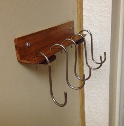
• A pre-drilled backboard and four hooks
• An easel (if you select that you need one). Easel styles may vary from the picture depending on stock available.
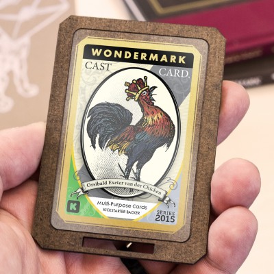
• The 29 calendar cards, every set hand-signed and numbered by both me and Max.
• A Dick Van Patten Is Not At This Address sticker of course

At this point I estimate that the finished calendars will start shipping out this coming Friday.

I should also note that I am splitting the profits from these calendars with Max — it couldn’t have happened without his fantastic contribution. So by picking up a calendar you’re supporting both me and him!

This is very different from the previous calendars I’ve done, but I really, really love it and I hope you like it just as much. I don’t mind being honest with you — I did not know if this was going to work. At every step of the process I could only see a half-step ahead, like lighting a dark path with a flashlight. Could I do drawings I would be happy with? Would the paintings look okay? Could we fit any text on the long skinny cards? Would the backboard idea actually hold the cards? But this is how we do things, folks. This is how all of us do things. One step at a time, and sometimes you take a risk, and sometimes it comes out amazing. I’m happy to report that this is one of those times.

Checking the records now, as I write there are only 26 copies left unclaimed. If this is a thing you might like to have, please do not delay! UPDATE: They’re all gone! Thanks so much!

Making the 2013 Calendar, Part 2

Here is Part 1, which details my thinking going into the making of this year’s Wondermark Calendar. I finally decided that I wanted to make another calendar this year, but began to think about how it could be done differently.

As detailed here, previous years of the Wondermark Calendar were comprised of cards sitting in brass desk easels. And since I knew that lots of people already had those easels, which are reusable, I knew that whatever I made this year should be about the same size as the previous calendars (which consist of a stack of 8.5″ x 5.5″ cards, thusly.)

But I also wanted to make it a progressive calendar, one that kept up with the days and weeks, rather than jerking to a halting stop every month until restarted. There must be a better way. A scroll? No. A waterfall? That doesn’t even make sense. A book? That’s not a calendar at all. Some sort of plant or food? Unexportable. A living animal with a lifespan of exactly one year? If I could figure that out, I wouldn’t be a cartoonist.

This is what I landed on:

It would be a stack of cards, each half the height of the previous calendar cards (which covered a month each), but each only containing two weeks. There would be no gaps between months. And when you passed the date on the top card, you could simply move the bottom card to the top and reveal a new two-week period on the bottom!

IT WAS THE PERFECT PLAN.

BUT WOULD IT WORK????

It sure seems to!

I’m not totally sure how it’ll read over the course of the year — it’s possible that it may take some getting used to, but ALL GREAT THINGS REQUIRE EFFORT so I’m not too worried about that. Overall I’m pretty intrigued by this concept — it seems archaic, in a pleasant way. It is even guaranteed to work if the power goes out (visible light permitting).

As you can see in this picture, rather than the cards sitting loosely in the easel as before, now they’re suspended from hooks affixed to a rigid backboard, which then itself sits in the easel. I think this makes for a very distinctive approach, but it does require some small amount of preparation. I’ll include a little baggie of hooks with each backboard (unassembled, so it can all ship flat), and I’ll even drill pilot holes in all the boards — so when yours arrives, you can put it all together in moments. I want this thing to work for you instantly.

Presumably, if this design works well and I decide to do another one, you will be able to keep the boards and simply re-order a refill of cards in future years! BUT LET’S TAKE THIS ONE STEP AT A TIME.

NOW, WHAT TO PUT ON IT?

The obvious elements to include on this calendar are: Dates. Holidays (including our new holidays). Illustrations and text.

I like inventing details about Gaxian culture (as in the Ask a Gaxian columns), so after a few misstarts and dead ends, I landed on the title THE GAXIAN ALMANAC.

Doing the math revealed that the calendar would need twenty-seven distinct cards to cover the entirety of 2013, so I decided to adorn each card with a factoid about Gaxian culture, history, or biology.

Now, it would be easy enough to make a bunch of Gaxian collage-images in the usual style. But since, for the first time, this calendar was to be machine-printed rather than hand-printed, I really wanted to do it in full color. And doing the collages would mean working at least partially digitally, when I really wanted this thing to feel hand-made.

So I started to draw.

TO BE CONTINUED…IN PART 3!!

The full title of the calendar is The Gaxian Almanac for Earth-Year 2013: Containing Elements of Knowledge Familiar to All Gaxians — An Entertainment for Enthusiasts; A Memento for Expatriates; and a Primer for Converts. It is available for pre-order now. As of this writing, out of 200 copies, only 124 remain. (UPDATE: They’re all gone now.) Each copy will be individually signed and numbered!

Announcing the 2013 Wondermark Calendar.

Last December, at the end of a significant period of stress that I never wish to repeat, I said this:

These beauties [the 2012 calendars] are wending their way to 175 of you right now. I hope you like them! They were very difficult to make. I will not be making them again like this next year; five years is a good run.

But not to worry! I have…another idea. A different idea.

It will wait to be revealed, until then. Stay tuned!

That time, my friends, has come.

BUT FIRST

An obligatory reminder about the TopatoCo shipping deadlines! Here is their grid of dates and different types of shipping services. Today, December 7, we start to get into the scary zone. If you’d like to make an order and have it arrive for Christmas, please don’t delay.

P.S. I stumbled across an overlooked box of limited-edition Machine of Death hardcovers! My eyes goggled out of my head when I realized what it was. They’re up now in my TopatoCo store.

My in-house store, selling holiday cards, stickers, books, and yes, calendars, will be shipping products through December 18. I can’t control the Post Office, and I don’t ship as much stuff as TopatoCo so I’m not as comfortable making predictions about arrival dates, and so I can’t make any guarantees — but most orders are going out within 24 hours, and will continue to do so until the 18th. (The calendars should start shipping by the end of next week.)

NOW THEN.

Six years ago, when I first conceived of the idea of making hand-printed calendars (as detailed here), it was because I had access to a Print Gocco screenprinting press. Popular in the eighties, and revived more recently by crafters and DIY fans, it’s a cool, compact printing device from Japan that uses expendable supplies such as bulbs, screens, and ink.

Unfortunately, the Gocco was discontinued by the manufacturer in 2005, and the number of supplies in their warehouses (and on retail shelves worldwide) began to dwindle. Fans of the Gocco’s simplicity and versatility have tried to come up with aftermarket workarounds, with some success; for the last couple of years, I was able to combine OEM and aftermarket supplies in strange ratios to get the calendars done.

But last year was the toughest: some of the third-party inks I found were difficult to work with, and all in all it became a much more complicated endeavor than I had anticipated. I still enjoyed the creativity and the craftsmanship involved, but the logistical hassles were proving increasingly significant.

A New Way Forward

The simplest solution would be to completely abandon the idea of doing calendars. Making calendars in general is a little scary, because you have a deadline to get them done (the end of the year, or more practically speaking, Christmas), and of course they have no shelf life, so you try to only make as many as you have demand for. I’ve been very fortunate that the calendars have proven popular, and I’m very grateful for your support — so I wanted to keep making something fun, for the challenge of it and to have something for those of you who ask after the new calendar year after year. But I didn’t want to run myself through a woodchipper to do it.

The first concession to the process was clear: future calendars had to be professionally printed. That was glaringly obvious. After investigating alternative hand-printing techniques such as letterpress, I realized that (at least for now), I’d rather leave the actual printing to professionals. This year’s calendars are being printed here in Los Angeles by DSJ Printing — the same company that makes my greeting cards, our Machine of Death cards, my MaxFunCon booklets, and any other strange thing I need done. These dudes are pros.

But I still wanted the product to have a lot of hand craftsmanship, to make it special. And I was curious if I could do something different with the format — to change the way a typical calendar operates.

What I don’t like about most monthly calendars is that all this:

…is just wasted space! Those are ACTUAL DAYS that get repeated on each page of the calendar, but are blanked out on the “wrong” page, just for the sake of breaking the pages into individual months. Additionally, when you’re on this day:

…you can’t look forward to the next week without flipping the page over and losing the current day. Your current day will show up as a blank square at best, or off the top of the page at worst, on the next month’s page.

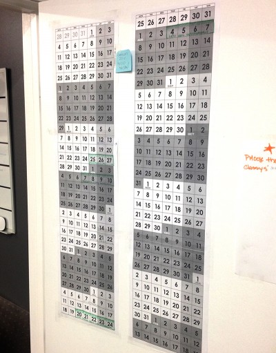
This is all pretty petty complaining, but I’ve always preferred full-week calendars like this one I made for my own office:

…because looking at the weeks and months all smooshed together back-to-back, AKA the way we actually experience time, just makes more practical sense. If today’s the 28th, which do I care more about: the month that’s gone, or the next few weeks ahead? EXACTLY.

To adapt this idea into a desk-friendly format, I came up with the idea for a a 27-page biweekly calendar, two pages of which are displayed at any given time. This way, no matter the current date, you always have at least two weeks ahead of you visible.

But how could it work? What would it look like? And how would it capture the traditional Wondermark-calendar charm?

THE ANSWERS TO THESE QUESTIONS…TOMORROW!


The 2013 Wondermark Calendar is now available for Pre-Order. UPDATE: They’re all gone now! (Ships mid-December.)