Announcing the 2013 Wondermark Calendar.

Last December, at the end of a significant period of stress that I never wish to repeat, I said this:

These beauties [the 2012 calendars] are wending their way to 175 of you right now. I hope you like them! They were very difficult to make. I will not be making them again like this next year; five years is a good run.

But not to worry! I have…another idea. A different idea.

It will wait to be revealed, until then. Stay tuned!

That time, my friends, has come.

BUT FIRST

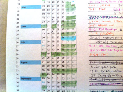
An obligatory reminder about the TopatoCo shipping deadlines! Here is their grid of dates and different types of shipping services. Today, December 7, we start to get into the scary zone. If you’d like to make an order and have it arrive for Christmas, please don’t delay.

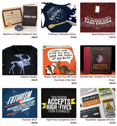
P.S. I stumbled across an overlooked box of limited-edition Machine of Death hardcovers! My eyes goggled out of my head when I realized what it was. They’re up now in my TopatoCo store.

My in-house store, selling holiday cards, stickers, books, and yes, calendars, will be shipping products through December 18. I can’t control the Post Office, and I don’t ship as much stuff as TopatoCo so I’m not as comfortable making predictions about arrival dates, and so I can’t make any guarantees — but most orders are going out within 24 hours, and will continue to do so until the 18th. (The calendars should start shipping by the end of next week.)

NOW THEN.

Six years ago, when I first conceived of the idea of making hand-printed calendars (as detailed here), it was because I had access to a Print Gocco screenprinting press. Popular in the eighties, and revived more recently by crafters and DIY fans, it’s a cool, compact printing device from Japan that uses expendable supplies such as bulbs, screens, and ink.

Unfortunately, the Gocco was discontinued by the manufacturer in 2005, and the number of supplies in their warehouses (and on retail shelves worldwide) began to dwindle. Fans of the Gocco’s simplicity and versatility have tried to come up with aftermarket workarounds, with some success; for the last couple of years, I was able to combine OEM and aftermarket supplies in strange ratios to get the calendars done.

But last year was the toughest: some of the third-party inks I found were difficult to work with, and all in all it became a much more complicated endeavor than I had anticipated. I still enjoyed the creativity and the craftsmanship involved, but the logistical hassles were proving increasingly significant.

A New Way Forward

The simplest solution would be to completely abandon the idea of doing calendars. Making calendars in general is a little scary, because you have a deadline to get them done (the end of the year, or more practically speaking, Christmas), and of course they have no shelf life, so you try to only make as many as you have demand for. I’ve been very fortunate that the calendars have proven popular, and I’m very grateful for your support — so I wanted to keep making something fun, for the challenge of it and to have something for those of you who ask after the new calendar year after year. But I didn’t want to run myself through a woodchipper to do it.

The first concession to the process was clear: future calendars had to be professionally printed. That was glaringly obvious. After investigating alternative hand-printing techniques such as letterpress, I realized that (at least for now), I’d rather leave the actual printing to professionals. This year’s calendars are being printed here in Los Angeles by DSJ Printing — the same company that makes my greeting cards, our Machine of Death cards, my MaxFunCon booklets, and any other strange thing I need done. These dudes are pros.

But I still wanted the product to have a lot of hand craftsmanship, to make it special. And I was curious if I could do something different with the format — to change the way a typical calendar operates.

What I don’t like about most monthly calendars is that all this:

…is just wasted space! Those are ACTUAL DAYS that get repeated on each page of the calendar, but are blanked out on the “wrong” page, just for the sake of breaking the pages into individual months. Additionally, when you’re on this day:
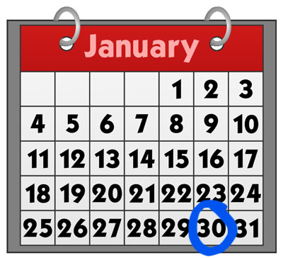
…you can’t look forward to the next week without flipping the page over and losing the current day. Your current day will show up as a blank square at best, or off the top of the page at worst, on the next month’s page.

This is all pretty petty complaining, but I’ve always preferred full-week calendars like this one I made for my own office:
…because looking at the weeks and months all smooshed together back-to-back, AKA the way we actually experience time, just makes more practical sense. If today’s the 28th, which do I care more about: the month that’s gone, or the next few weeks ahead? EXACTLY.

To adapt this idea into a desk-friendly format, I came up with the idea for a a 27-page biweekly calendar, two pages of which are displayed at any given time. This way, no matter the current date, you always have at least two weeks ahead of you visible.

But how could it work? What would it look like? And how would it capture the traditional Wondermark-calendar charm?

THE ANSWERS TO THESE QUESTIONS…TOMORROW!


The 2013 Wondermark Calendar is now available for Pre-Order. UPDATE: They’re all gone now! (Ships mid-December.)

Victorian Portraiture at MaxFunCon


Flickr photo by liezlwashere

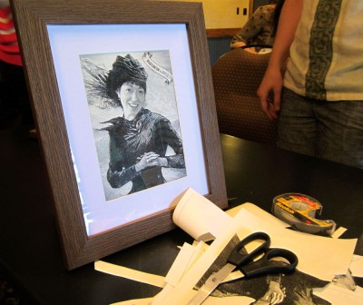
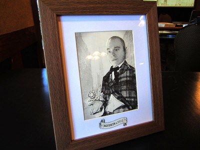
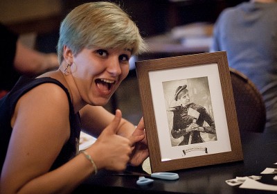
A few weeks ago, at the fourth annual MaxFunCon, I had the great fun of leading a hands-on seminar: “Victorian Portraiture The Easy Way.” I brought scissors and tape and let people make their own Victorian-style collage portraits!

Like this (click for bigger):

Out of this:

Another example! FROM THIS:

To the inarguably superior THIS:

I’ve posted a Flickr set of a bunch more of these, if you’d like to take a look!

The official MaxFunCon photographer also took a bunch of pictures, starting here.

This was a ton of fun! Thanks to Nick White and Jesse Thorn for inviting me to MaxFunCon this year. Now I have a seminar I can lead…ANYWHERE

Classy Photo Contest – Second batch

Following up from last week’s Classy Comic Recreations, here are some of the other entries in the Classy Photo Contest!

The task at hand was to “take a classy photo featuring yourself (or other humans or animals) along with any item(s) from the Wondermark Goodsery. Define ‘classy’ however you want — it doesn’t necessarily have to mean ‘wearing a top hat’ although that is probably fine.” Judging is based on:

20% Classiness
30% Quality of photography
50% Creativity
+10% Extra credit for description

So here we go! Thanks to all who submitted. Selected favorites ahoy:

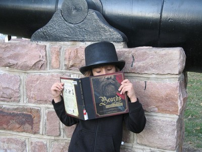
Classy Reading

My brother reading Beards of Our Forefathers by an old cannon in a South Dakota city park, of all places. It was tricky to photograph him because he wanted to look at a specific page (I can’t remember which, though) and he kept moving his nose so his and the book’s wouldn’t line up well.

And yes, that is a top hat.

This appears to be the same brother as in the dinosaur picture from the last post! The tried-and-true “use the book as a beard mask” is a strong move. SCORES:

Classiness: Child, in top hat, near cannon. Yes. 13/20
Quality of photography: Crisp, colorful. Would have liked to see more cannon maybe? 15/30
Creativity: The beard-face has been done before, but this gains some creative points from using what appears to be a library book. 20/50
Description: Straightforward but nothing fancy. +5/10

TOTAL SCORE: 53/100

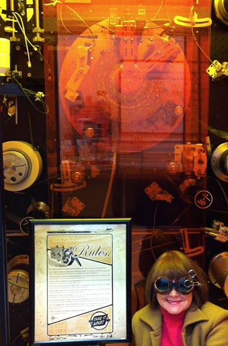
RulesMicon

We use The CSBCM Rules to build our Infernal Devices.

This nicely framed copy of the Tinkerer’s Rules appears to be adorning something large and terrifying! Those are my two favorite adjectives, so well done. SCORES:

Classiness: Goggles are a plus. 12/20
Quality of photography: I would like to see more of the large and terrifying thing! 10/30
Creativity: This is a fairly straightforward snapshot, but I appreciate seeing the poster in the wild regardless. 12/50
Description: What is this terrifying thing? Tell me more about everything in this picture! +2/10

TOTAL SCORE: 36/100

In Which Security Camera Footage from the Art Gallery Comes Into Play

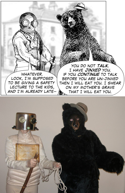
“Goodness, no!” said Foppish Bear, “That isn’t me perpetrating the most classy of crimes, the Art Heist. What, do all foppish bears look the same to you? That, my good man, is quite Racist.”

Nicely done! And quite a handsome wall of Wondermark comic prints you have there as well. SCORES:

Classiness: Art gallery theft is inherently classy. 12/20
Quality of photography: Grainy but clearly on purpose. It’s obvious what’s going on, and that’s what’s important. 18/30
Creativity: I am definitely on the watch for thieving bears after seeing this picture. 35/50
Description: Totally fine. +8/10

TOTAL SCORE: 73/100

A Traveling Wondermark Dispensary

Get you Wondermarks here! Cheapest Wondermarks on the eastern seaboard!

Alex here appears to have one of pretty much everything I’ve ever made. I like this Alex fellow. If you see him try to sell you something out of his trunk, at least flip through the books a little. They might not be too bad. SCORES:

Classiness: A serape is always a nice touch. 12/20
Quality of photography: Clear and bright. 15/30
Creativity: I am having fun imagining the trials and tribulations of a bootleg Wondermark vendor. 30/50
Description: Says what it does, does what it says. +5/10

TOTAL SCORE: 62/100

From a Perpendicular Universe

Our subject from a nearby perpendicular universe is caught at his leisure.

Another entry from Alex, featuring my book Clever Tricks to Stave Off Death! I do not know if this strange sideways-world is one native to himself or one that he has entered strictly for the sake of the photograph, but either way I appreciate the view of it. SCORES:

Classiness: Sitting on steps is somewhat classy, I suppose? 8/20
Quality of photography: Colorful and interestingly angled. 18/30
Creativity: I will assign this value capriciously. 20/50
Description: Straightforward. +5/10

TOTAL SCORE: 50/100

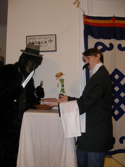
Foppish Bear and Piranhamoose™ Brand Slab’o’Meat Product

Foppish Bear only eats the finest meats: Piranhamoose™ Brand Slab’o’Meat Product, made from the finest elk, caribou and small game, with just a hint of man-flesh. Piranhamoose Slab’o’Meat Product — Sometimes you just want a slab of meat.

One of several entries featuring the Foppish Bear and a complete Piranhamoose™ line of questionable nutriments, this one struck my fancy for featuring what appears to be an entirely genuine mound of raw meat. SCORES:

Classiness: Meat is classy. Moustaches are classy. Knives — need I say more? 17/20
Quality of photography: A bit flash-heavy and flat. 6/30
Creativity: This couple appears to have spent an entire evening taking pictures in a moustache and a bear suit, and I have to respect that level of commitment. 40/50
Description: Just what we need. +10/10

TOTAL SCORE: 73/100

In which Señor Gamberro wrestles with literacy

Not wanting to be perceived as lacking the wit befitting a gentleman of his standing, the good luchador had taken to engaging in various forms of popular humorous scholarship.

This photo from Paolo fulfills a lifelong dream of mine, which is, of course, to see my work being read by a person in a luchador mask and suspenders.

Classiness: Aforementioned luchador mask and suspenders. 16/20
Quality of photography: The angle and setting could use some imagination. 13/30
Creativity: Where’s the action? I get that this is a bookish luchador, but that ain’t the event I bought tickets for. 18/50
Description: Clear enough! +5/10

TOTAL SCORE: 52/100

In which Alex only has as many books as she could carry.

(pictured: a puddle of books) It’s impossible, really, to carry such a sea of books as she owns. Others don’t understand how she could need so many books in the first place, but she breathes the stuff. She is, without a doubt, a bibliophibian. Also, she has a nice hat.

Alex models the Bibliophibian shirt to nice effect. Past the point of no return, she feels the ink in her lungs, and she smiles. SCORES:

Classiness: She does have a nice hat. 12/20
Quality of photography: Sufficiently moody. 20/30
Creativity: I must ask again, as I did with the other Alex: is this a pose or just a natural state of being? 30/50
Description: Nicely done. +9/10

TOTAL SCORE: 71/100

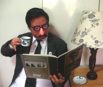
In which Herschel waxes intellectual about petty concerns

The Alderman had the singular ability to derive rather stunning insights from the most trivial reading material.

Another from Paolo. I’ve looked at this photo a dozen times now and I only just realized that those weren’t his real eyes.

Classiness: The celebrated disguise is class personified. 14/20
Quality of photography: A bit flat but fine. 13/30
Creativity: I have a feeling Paolo just looked around for things he could wear to make the photo interesting. STILL: I am game enough to expand my lifelong dream (above) to include any kind of vaguely creepy mask, so this counts. 25/50
Description: Does its job. (But “trivial”??) +5/10

TOTAL SCORE: 61/100

Bibliophibian

Instead of spending all the money on her book collection, she should have spent a few dollars on a life vest too. She was too invested in reading to notice that she was drowning in it too. Maybe with all the knowledge from her books, she can grow gills and become a bibliophibian.

Another from Alex II, same as above. Clearly this photo was taken earlier in the evolution/conversion/assimilation process. SCORES:

Classiness: I don’t even know how to define this anymore. 10/20
Quality of photography: Strongly dramatic, highly evocative. Would like to have seen the shirt a little better maybe? 28/30
Creativity: Again, is this just Alex’s daily life? Still, a nice pose and a nice shot. 38/50
Description: A cautionary tale for the ages. +8/10

TOTAL SCORE: 84/100

Megan and Helena being extraordinarily classy whilst perusing the wondrous Wondermark anthologies.

There was going to be a third in this photo, but our canine counterpart was being less than cooperative. Thus, the third top hat is being worn by none other than the Classy Chair.

If classy can be defined as “wearing a top hat”, how do we define *3* top hats?

Very strong entry. The sepia filter is a bit of a cheat but it’s one I’m certainly not above using myself. High marks for the full costumes (and of course, the full complement of books.) SCORES:

Classiness: It is impossible to get classier than this. 20/20
Quality of photography: A bit staid but nicely evocative. 25/30
Creativity: The question remains! Is this simply a regular day in their life?? 36/50
Description: Does the job but makes me miss that dog! +7/10

TOTAL SCORE: 88/100

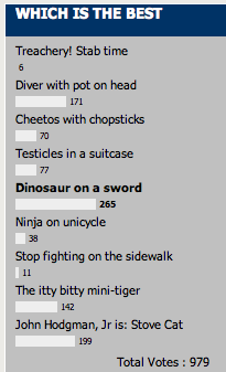
NOW. Before announcing all the winners and prizes, let’s turn our attention back to the Recreate-a-Panel photos (which are all so super wonderful). You voted for your favorites from that set, and the results, as of this writing are:

So the winner of that category is Diny the Stegosaurus and friend:

Which is awful hard to beat. Congrats, team! You win one of anything you like from either Wondermark store (either my own or TopatoCo).

The winner of the photos on this page is Megan & Helena with their extra-classy shot! Megan & Helena win one of anything they like from either Wondermark store. Congrats & thanks for the picture!

An honorable mention goes to Alex the Bibliophibian as well, just because I really like that shot of her reaching out of the books. Alex, let me give you one of my books to add to that stack, if there are any of my own that you’re missing.

And finally…my discretionary award for BEST IN SHOW goes to…

Just because I want to look at this picture and nothing else for the rest of my life. I will take to the grave the fact that I made people do this. Simply wonderful.

I should also mention that this photo is brought to you by the team that also contributed the Stove cat photo, the Leopold photo, and the photos above featuring Foppish Bear. So this is a well-deserved Lifetime Achievement Award as well. Nice work! You win $100 cash!

Winners please email me to claim your prizes: dave at wondermark dot com. Thanks everyone!

Holiday cards, new book, and more!

I’m super-pleased to announce some neat new things for the holidays! Quick links:

  1. General Holiday Shipping Notes
     
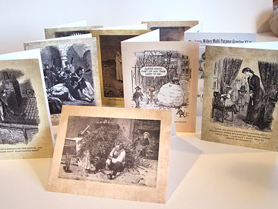
  2. New Greeting Cards!
       Description belowStore link
     
  3. Artist Editions now available!
       Description belowStore link
     
  4. New book: The Compleat Dispatches from Wondermark Manor!
       Description belowStore link

Read more

Boom! And a Bear Comes Out

I wrote a song! It has been running through my mind for a long time, and I finally said “You know what? It is time to FINISH THIS. Time to lay it down. Time to make it the PARTY HIT OF THE SUMMER.”

Boom! And a Bear Comes Out from David Malki ! on Vimeo.

I hope you like it!

If you also have a nagging “cool thing” that you need an excuse to finish, why not submit something to the Machine of Death Talent Show? We’ve pushed back the submission deadline to April 20, and we will accept video performances from remote participants (although if you’re in the Los Angeles area, we’d love to physically put you on the stage)!

More info here. If you can’t submit something, we hope you’ll at least watch the show on the evening of April 26, either live in Los Angeles or livestreamed at MachineofDeath.net. Here’s the Facebook event!

I will tease you with this as well: everyone who’s able to attend the show in person will go home with a very special item that we’ll be unveiling the evening of.

Admission will be free, so if you can’t make it, send your Los Angeleno friends!