(Click any of the images to zoom in on them.)
Shoe was in my hometown newspaper growing up, and I read it every day, just like I read Fred Basset and Herb & Jamaal and Marvin, and I don’t think I ever laughed at any of them, ever. But I did look forward to reading Shoe, especially on Sundays, because the fledgling artist in me was drawn to Jeff MacNelly’s expressive brushwork — I wanted a DeSoto like Cosmo’s, with tailfins jutting skyward; I loved the collection of jagged lines that created, with negative space, a towering stack of papers on the Perfesser’s desk. So it is with a shade of reluctance that I must admit that Shoe sucks.
Like most comics that’ve been around over a decade, Shoe is not drawn by the original creator. When Jeff MacNelly passed away in 2000, Chris Cassatt and Gary Brookins, both editorial cartoonists in their own right (like MacNelly himself), took over daily production of the strip, aided by MacNelly’s widow Susie and a pair of staff writers. Cassatt and Brookins have achieved a fine pastiche of MacNelly’s style; they draw very decent trees, and all the characters look like they’re supposed to. But perhaps due to their training and experience in editorial cartooning — a field in which brevity is livelihood — they struggle with using the newspaper gag strip format to its full potential, often stretching a simple, lame gag out over two wide panels (when a third panel, and accompanying second punchline, would be no chore to add):
And despite the wide canvas available to them on Sundays, Cassatt & Brookins choose to maintain the languorous pace:
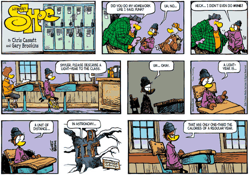
The example above is strikingly typical in its slowness: in fact, every Sunday Shoe that I examined could easily be retold in a daily three-panel format without losing anything but unneeded fat. The characters speak in ellipses, breaking a single sentence into labored wheezing over the course of three or four panels; brief, few-word back-and-forth conversations inexplicably take the entire strip, with only one dialogue balloon per panel. The wasted space speaks of wasted potential — both for the existing jokes, which suffer from the meandering pace, and for the additional jokes that could easily fit into the same space, making the comic snappy and unexpected. Instead, we get the above, with shadowy panels, cutaways to exterior shots, and subtle changes in perspective trying desperately to fill time while the characters move in slow motion.
Like most Sunday comics, the above episode of Shoe features a two-panel throwaway gag in the first position. This is for the convenience of the editor at each particular newspaper: depending on space constraints, the editor may choose to run the comic as-is (title panel, two-panel gag, and main gag); or he may choose to clip the top three panels and run the main gag alone. Also, the careful grid-like arrangement of the panels is no accident — this is so the editor may rearrange the number of panels per row, again for reasons related to the space available on the page.
In fact, the preferred panel arrangement for the above comic is probably the following (a quick check on the official Shoe website tells me I am correct):
The difference is slight but significant. In this latter arrangement, the title and the two-panel gag are all on one line, and the main gag begins on a new line. This provides a beat of separation between the two, and it is easy for the reader to “complete” the first gag before starting to read the second. In the former arrangement, there is no such separation, and the entire arrangement reads like one long gag, making it that much more unsatisfying when the end is finally reached.
In other words: the two-panel gag, with the tough in the green threatening Skyler, is a single, standalone event, and Skyler’s answer “Heck…I didn’t even do mine!” is the punchline. The teacher asking Skyler to describe a light-year is the beginning of the main gag, which terminates five panels later. But when the panels are rearranged, Skyler’s “Heck” line doesn’t act as a punchline; instead, it’s a setup for the panels that follow it. Not only does it lower the total gags-per-comic quotient by half, it also means that Skyler’s “calories” punchline at the end of the whole ordeal is even lamer for having had seven panels of setup.
This is an argument for retaining the artist’s intended layout when reproducing comics. It’s an argument that Bill Watterson fought and won, largely by refusing to carve his comics into modular blocks that could be rearranged, knowing that editors would have no recourse — they wouldn’t dare cancel his wildly popular feature. Watterson’s victory has had a wicked backlash; many metropolitan newspapers today are subjected to the vulgar garishness of Berke Breathed’s Opus above the fold on the front page of the comics section, a prime position that Breathed won in the wake of Watterson’s trailblazing, and a position that he has used to curse the people of America with his bleatings.
But Opus will be the subject of another column, perhaps; in the meantime I think that the above Shoe will benefit from a greatly accelerated pace, or at least a more judicious use of the space given. To add many layers of density to the comic would be to violate the regular spirit of the strip, which is a problem I am unconcerned with:
Until next time… I’ll see you in the funny papers.
— December, 2006


