I just don’t know. I hope you have been keeping well!
I have been holding things together here at home with the family, working most waking hours on Professional Work, regretting the loss of our daycare, and falling into bed exhausted most nights.
Getting a toddler into bed is like putting a motorcycle away with the throttle stuck open. It can be done, but it sure exhausts your reserves of willpower.
Here are the haps lately
• Before the pandemic, I was invited up to Sideshow Collectibles to participate in their YouTube show “Strike a Pose.”
Our episode is out now, featuring me and my pals Dave Kellett and Shing Yin Khor:
• My dear sweet 18-year-old Feral Cat (not really feral) has been at the vet for the past few days.
An evening serenade for you from #feralcat pic.twitter.com/20IaHlIt9n
— David Malki ! (@malki) April 24, 2020
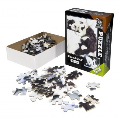
If you’re into cute little puzzles, this would be a great time to pick up one of the last few Feral Cat double-sided puzzles for just $6 (or any of my other puzzles for $12)!
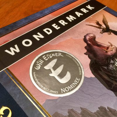
• I lost the Eisner Award. (As in, I didn’t win — not that I physically misplaced it.)
That’s okay! Phil LaMarr said my name, which was pretty cool.
• My new favorite shirt is the ink swatch sample shirt from the shirt printer. A lot of people seemed to think it was as weird and charming as I do:
Lot of nice comments on my shirt today! It’s the ink swatch sample shirt from the shirt printer pic.twitter.com/E2La6waaua
— David Malki ! (@malki) July 17, 2020
So, sure — I’ll print one for you too, if you like!
(Note that instead of the words “Men’s” and “Women’s” for shirt sizing, I’ve started using “Straight fit” and “Curvy fit.” In case you aren’t familiar with those terms!)
Here’s some other things I’ve enjoyed recently, and I think you might, too!
• This short film:
CAVEMASTER | adult swim smalls
Is now not a good time for you, Cavemaster?
Created by Graham Mason
Starring Nicole Boettcher pic.twitter.com/MrzaOMxEdR— adultswim (@adultswim) August 11, 2020
• This article about how LEGO bricks can embody principles of interface design:
LEGO interface panels are beautiful, iconic, and great for learning interface design basics.
I bought 52 of them from BrickLink and had a lot of fun last week analysing the design of them all. Here's what I learned: https://t.co/MryEwjSq1f— George Cave (@George_Cave) August 3, 2020
• This oral history of Weekly World News:
"In the beginning, we were very careful about facts. And then several years later, we were writing about space aliens, Bigfoot, and Bat Boy." https://t.co/h82wDBJivO
— Lilit Marcus (@lilitmarcus) August 9, 2020
• This touching but very funny story about Carl Reiner:
I have a Carl Reiner story that I hold very dear to me. I figured I'd share it today, on the day of his passing, because I hope it will bring some other people some joy the way it does me.
— Matthew Rosenberg (@AshcanPress) June 30, 2020
Comics will be published irregularly for the time being! The best way to stay up-to-date is to make sure you’re subscribed to the email list or the Twitter feed. Talk to you soon!!